Showing posts with label fountain pens. Show all posts

Thursday, March 03, 2016

Color Overload: Selecting a Fountain Pen Ink


Inkswarm. Yes, that says "Ink!" My handwriting is funky.

So, you have a fountain pen or two, and now you're ready to stock up on ink. But which?

Some of you will just buy boxes of black or blue cartridges or a bottle of black Parker Quink at the local office supply store and be good to go. You're sane. Carry on.

But some of you are like me. Ever since the days when I first saved up my allowance for bigger and better boxes of crayons, I've been on a quest for MOAR COLOR. Colors--so many colors and so many nuances!--were part of what drew me to fountain pens to begin with.

On top of color, there are other little attributes that may matter to you: do you need water resistance? Does it matter if the ink fades over time or under certain conditions? Does it bother you if an ink takes a little time to dry? What kind of paper do you write on most?

These days, the options are mind boggling, and thanks to the wonders of the Internet, you can easily get your hands on just about any ink on Earth. But how on Earth do you decide what to choose?

1. Google them. (Or Bing them, or whatever floats your boat!)

There are many wonderful people out there with great cameras and scanners and a much better eye than yours truly who put in the time and effort and skill to come up with beautiful and exhaustive reviews. If you search for, say, "Iroshizuku Kon-Peki review," you'll be presented with all sorts of reports, some including comparisons with similar inks, some showing how a given ink behaves in different pens and on different paper, some testing water resistance, etc., etc.

In addition to blogs, more and more fountain pen vendors are getting tech savvy, and have swabs and comparisons up for viewing. Goulet has some of the best in the biz, including their nifty Swab Shop, which has a tool to allow you to compare similar inks. (Disclaimer: I have absolutely no affiliation with Goulet except as a satisfied customer who thinks they do a grand job).

This may be enough to help you decide. It's how I chose my first bottled inks. However, be aware that scanners, cameras and monitors can all vary dramatically. What you see may not be what you get. It will get you in the ballpark, but isn't quite the same as seeing the ink in person.

2. Find penpals with ink!

Most ink crazy people are only too happy to spread the madness. If you have friends who have inks you're interested in, have them write you a letter using those inks. You'll give them an excuse to play with their pens and ink, AND you'll get to see the ink in person. Win win!

3. Cartridges

This isn't always an option--not all inks are available in cartridge form, and some companies' cartridges are proprietary, but in some cases, you may be able to buy ink in cartridges before committing to a full bottle. This is how I first discovered what is now Waterman Inspired Blue, for example. Be careful that the ink you are buying works with your pen. Here's a good table on the subject.

Most vendors will be happy to answer your questions on this before you buy!

4. Samples

Some companies will sell you a few milliliters of ink in a small vial, so you can try before you buy. Goulet Pens is the one I'm most familiar with: I'm still working through the boatload of samples I bought a few years ago. You will need a way to get the ink into your pen, which can be a little harder than with a full bottle. What I generally do is to use pens with converters for this testing, and fill the converter via a blunted-needled syringe, a la this older blog post o' mine.

This method gives you the ability to test ink on your terms: in your pens, with your style of writing, on your paper.

You may also be able to trade ink samples with friends. I've sent samples out in the past!

So there you go. Hopefully this makes the whole ink shopping thing feel a little less intimidating. And, going back to you black Quink folk...don't be afraid of a little insanity now and again!

Tuesday, February 23, 2016

Three More Inks: Waterman Tender Purple, Noodler's Purple Heart, Noodler's Lexington Gray

More mini-reviews as I continue to try out a backlog of samples from Goulet Pens. I don't have my old camera up and running and my phone is being kind of stupid when it comes to focusing, but the colors are more important than my scribbling anyway...

1. Waterman Tender Purple

Continuing the theme of liking inks I shouldn't and disliking those I should, I (a firm believer in permanent and water resistant inks) love with this ink. It is silky smooth, has a perfect amount of blue to the color (I prefer violet leaning purples) and is so vibrant I could kiss it.

It also becomes illegible if you so much as drip condensation on it from a frosty beverage.

I'm not sure if I could live with this ink, but I like it an awful lot. My perfect purple would be this color, but with at least enough water resistance to leave me something to trace. I ended up ordering Noodler's North African Violet to fill that role. It's not a perfect match and it doesn't have the silky smooth nib feel of the Waterman, but it is a vibrant purple with strong water resistance.


Noodler's North African Violet

2. Noodler's Purple Heart

This is a Goulet Pens exclusive. I admire the sentiment behind the ink, and (like other Eel inks I've tried) I like the writing quality, though (as with the Cactus Fruit I mentioned previously) it can disagree a bit with poorer quality paper. However, the color...isn't what I expected. Much more toward the red side of purple, and just generally...missing something. It's all right, but I don't need any more.

3. Noodler's Lexington Gray

How exciting can grey be, right? It's basically just black with some light shed on it. But I like this ink. I find it soothing. It is a rather true grey--DIY chromatography (dripping ink on wet paper towel) doesn't reveal much if any other color in the mix. Really, it looks a bit like pencil might if pencil was liquid with shading. And maybe that's why I like it--that and the fact that it's one of Noodler's "Bulletproof" colors, waterproof and fade resistant, and very well behaved even on pretty crummy paper.

Being as how I have so many other business-like inks already, it doesn't quite make the current wish list, but I don't rule it out forever, either.

Monday, December 07, 2015

Tracking Inks and Pen Rotation

Quick and dirty blog post based on a momentary Twitter discussion re: keeping track of fountain pens. If you're a nice logical person who keeps one or two pens inked with the same inks all the time, this does not apply. If, like me, you occasionally find yourself with six or seven or...um...nine, you may need a memory jogger for what's in what, especially if you bought samples of eleventy billion dark blues that are all very subtly different.


So this is my method. It's not fancy. If I get fancy, I fall behind, so I save notes on what I like or dislike about inks for my journals or blog posts.

As you can see, I'm rather fond of that Orange Safari. And even in a lousy nighttime photo, isn't the Cactus Fruit cool?

Anyone else log what inks they're using? How do you go about it?

Wednesday, December 02, 2015

Three Inks: Terre de Feu, Cactus Fruit, Scabiosa

As I'm going through these Goulet Pens ink samples, I thought I'd toss out a few little mini-reviews! So here you go. My opinions only, and your mileage may vary.

1. J. Herbin Terre de Feu

I really, really wanted to like this ink. In a very wet writer, I think it'd be quite nice, and it does have interesting shading. However, like many J. Herbin inks, I find it too dry for my tastes, and not saturated enough. In a less than fire-hose-ish pen, it comes out a pale pinkish brownish orange, which just doesn't appeal to me.

Ruled out.

2. Noodler's Cactus Fruit Eel

This is an ink I like more than I should probably admit. I mean, it is BRIGHT. Obnoxiously bright. It is not really a "grown up" color. But ooh, so cheery! It isn't a super duper match for more absorbent papers (the "eel" lubrication factor, which is supposed to make pistons work a bit better, seems to make ink spread and feather a bit more than standard), but it is a pleasure to write with.

This one goes on my wish list.

3. Rohrer and Klingner Scabiosa

Scabiosa sounds gross, no? But it actually just means honeysuckle. What a difference a language makes. This is another ink I wanted to like: it has an iron gall component, which makes it somewhat water and fade resistant, and in the right pen, it might be kind of nice. However, in my fairly dry-writing modern converter pens, it felt...like writing with a toothpick. *shudder* And the color ends up being a pale imitation of itself. I think. Reviews of this ink vary so much, I'm not completely sure what color it actually is--I expected a dusty purple, but it looks more...pinkish grey.

Ruled out.

Friday, November 27, 2015

Ink fest!

There's one benefit to at least starting NaNoWriMo this year: it got me back to writing by hand, which a) I enjoy and which b) seems to jog my creativity a little, or at least gives me a longing for creativity, which is sometimes the key to finding it again.

This is maybe a third to a half of the full stash...

I still have more fountain pens than any one person needs. At least they're small! At the moment, I've been leaning toward the cartridge converters, partly because they're often simpler to maintain, and partly because...well. Let me tell you.

Back when I first discovered Goulet Pens and their ink samples, I ordered about a billion* ink samples. Because, hey, I could! And look at all the pretty colors! And then life got in the way and I used pencils a lot for awhile there and I pretty much forgot about the ink samples until I moved, and then realized I still had about a billion* minus four.

So this has been a month of playing with inks again, primarily in my Pilot Metropolitan and the Lamy Safaris, since they're cheerful and easy to clean out. I've only actually emptied a few vials, but it's a start.

Empties!

Of course, now I want a bottle of Noodler's Cactus Fruit Eel (it's so bright and happy!) and a bottle of Waterman Tender Purple and a bottle of...

But not until I've used up at least half a billion more vials, I think.

*slight exaggeration

Edited to add: here's a post with a bit of info about how I get ink into my pens! 

Monday, November 02, 2015

NaNoWriMo Go!

And boom,NaNoWriMo has begun!

I spent September buying a house and moving out of my rental, and I've spent October trying to unpack and move in and make it pretty, so I've had no time to plan and have almost no idea what I'm going to write. I'm taking a stab at a sort of light fantasy take on moving to a new home, since I don't think I'm up for much else.

And because I'm currently in fountain pen mode (the pendulum swings a bit, as you may have observed), I'm writing by hand again. So far the pen and ink line up is as follows:

  • Lamy Safari (Green) - J. Herbin Lie de The (sample)
  • Waterman Phileas - PR Lake Placid Blue
  • Lamy Safari (Orange) - Waterman Tender Purple (sample)(still don't like the new ink names, Waterman!)
  • Pilot Custom 74 - Pilot Iroshizuki Kon-Peki (cerulean blue)
  • TWSBI 530 - Diamine Majestic Blue
  • Pilot Vanishing Point Twilight (the most beautiful pen EVAR) - Iroshizuku Tsuki-Yo ("moonlight" blue)

I like to switch color every page or so during a long writing session, as well as at the beginning of the day. It's good motivation (makes it easier to see how much I've written in a sitting), and this should give me enough variety to keep things fun. All of these are good workhorse pens and relatively trouble-free inks. I'm a little heavy on the blues--may switch one out for a green next time a pen comes up empty.

I wrote eleven pages (comp book sized, but college ruled!) yesterday. Still got it. Now if I can just keep it up for thirty days straight...

Saturday, June 07, 2014

Eeeevolution Resolution

Just wanted to thank those of you who took the time to comment on my recent post (now hidden) regarding the once and future Little Flower Petals. I appreciate the thoughts! My conclusion: I think I'm going to keep it like it is, and go back to using Thorns and Blossoms as originally intended, for more faith related and introspective posts. Of course, now I've already confused everyone, but hey.

For better or worse, Little Flower Petals is a reflection of me: rather messy, generally (but inconsistently) enthusiastic, occasionally morbid, tending toward self-indulgence and impatience but striving for generosity and kindness, and always eclectic. I suppose anyone who knows me well knows all these things already, and will not be shocked. And if they don't...well, I yam what I yam, and it can't hurt to reveal it.

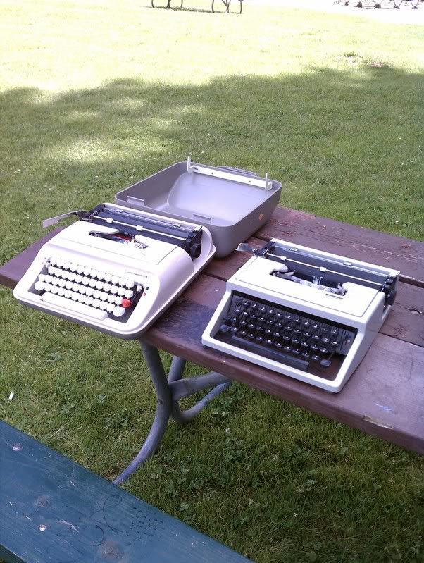
An example of being what I is: I sold a typewriter today (the Olivetti Underwood Studio 21, since I need to raise fund for the road trip with my sister at the end of the month AND I don't like typewriters sitting around unused and I tend to use the Olympias). As I was getting ready to head out, scrambling to find some scrap paper and the typewriter dust cover and all, I realized my hands were all stained with fountain pen ink, and had to stop to scrub THAT off. Yep, that's me.

Incidentally, the Studio 21 went to a good, typewriter loving home. You know you've sold a typewriter to a real enthusiast when you bump into the buyer again five minutes later at the Goodwill down the road where you've headed to check out possible "new" machines in spite of yourself....

Wednesday, May 28, 2014

Rotation, Rotation

I appear to be in nerdy over-analysis mode for the moment, so here we go again.

The other day, I was writing with a ballpoint and realized I was rotating it slightly--sort of rolling it to the left--at the end of each line, or whenever I lifted my hand for a moment. It's something I do--something we all do, I assume--with wooden pencils without even thinking about it, so the point wears evenly, but it has no real purpose with pens except to sort of reseat your grip every so often. The only reason I noticed was because the clip on this particular pen kept getting in the way now and again, and I finally figured out it was coming around the rotation every so many lines and rubbing against my hand--until I rotated it away again.

I do this with mechanical pencils, too, to the point where when I picked up a Uni Kuru Toga pencil (which rotates the very point of the pencil for you to maintain a consistent point), we fought--because I couldn't break myself of the habit of turning the pencil, even though it was rotating for me.

Now...obviously I don't do this with fountain pens, or they'd stop working every time I got to the end of a line. So my subconscious apparently has it figured out that they're another species. Why, then, does it lump most other pens with pencils, I wonder?

Interestingly, I appear to rotate pencils to the right and pens to the left. That's even weirder.

Are you a rotator? Do you keep rolling in a particular direction or is it random? Does your brain distinguish between pencils and pens?

Friday, February 14, 2014

Horses for Courses

I've tended to cycle back and forth on writing instrument preferences. For a while I'll swing more or less totally pencil or completely fountain pen, and then back again. Lately I've been using fountain pen for work notes again--enjoying the brighter colors, greater contrast, and lack of smearing once dry.

So last night when I jumped back in to working on my NaNoWriMo story, I thought I'd switch to pen there, too. I sat down with my notebook and wrote about three words before panic set in.

Aw, heck no.

I guess I need a certain amount of impermanence to feel comfortable when fiction writing. For now, at least, with this particular story. So I dropped the fountain pen like a hot potato (not literally--you fountain pen lovers can get off my back) and went back to pencil. Whew. Much better.

How about you? Do you use different tools for different purposes? Switch from one to another over time based on mood? Or is it all or nothing?

Sunday, December 29, 2013

A Number of Housekeeping Items

1. As one New Year's Resolution, I've decided to finally complete the editing process on The Secret Princess: a kids' chapter book I wrote some years ago for my little sister. It's a princess-and-goblins-and-dragons-and-a-quest sort of thing, pretty lighthearted and silly. I'll hopefully be looking for a few beta readers by late January. Preference given to those who have or have been young children.

2. I have too much fountain pen ink. I really have a handful of colors I like best, and now that I can get samples from Goulet Pens when I have the itch to try something out of my usual realm, I don't see the need to keep a lot of it around. I will be selling off a bunch, at least if The Fountain Pen Network ever comes back up. In the meantime, though, if anyone wants dibs on a bunch of Private Reserve blues and greens (Avacado (sic), Sherwood Green, Midnight, Black Magic, Lake Placid), or a 90% full bottle of Noodler's Blue-Black, let me know.

I may also be selling off or giving away dip pen nibs, some pencils, and a few fountain pens (nothing super fancy), so watch this space!

3. You must go read Mike Clemens' and Richard Polt's reports of the Bay Area type-in on the 27th. (Please feel free to add to my list if you were there!) Looks like a great time was had by all!

4. And now back to actual, real housekeeping. I'd like to start off the new year feeling like I could at least have my more forgiving friends over without fatal shame...

Wednesday, January 02, 2013

Not Quite DIY, Semi-Premium, Semi-Custom Notebooks

Notebook cover
You'll have to pardon the cell phone photos...my camera wasn't available.

I believe I've previously mentioned my fondness for HP Premium Choice 32 lb. LaserJet paper (ain't that a mouthful?) for fountain pen use. It is lusciously silky smooth, but less slickery than some other nice papers. Inks spread a teensy bit more than they do on Clairefontaine, but I like the way inks look on this paper, and they dry within a reasonable time frame, too.

It's pricey stuff at about $18 a ream. Ouch! But awhile back, Office Depot had a seriously discounted special: eight dollars a ream. I snatched up two reams immediately, to add to the half a ream I still had on hand. That's a lot of paper. I use it mostly for general writing, letters (heavy though it is), and sometimes in my Circa / Staples Arc notebooks...though at this point I've come to use Circa most for temporary work notes, and for that, I prefer to use scrap paper...seems a shame to waste anything nicer. As for journals, I prefer more permanent binding solutions, but I have no bookbinding skills of my own.

So...I took two notebook-sized stacks of the paper (96 sheets each) to a local copy shop and had them coil bound. They aren't fancy, but I'm still quite pleased with the results.

Coil binding detail

From the research I did, the total cost for covers and binding is typically between $3.50 and $6.00 depending on where you go, with office supply stores being predictably more affordable than Kinko's. This makes these notebooks a far cry from 50 cent composition books. However, if I compare the total cost to something like Clairefontaine, they aren't too bad, *and* you get to pick your paper (cream or white or whatever, weight, texture) and your ruling, or lack thereof. This first batch of two notebooks is blank, but I may print lines or dot grids next time around. I've used this site in the past, and find it very useful. My normal handwriting is on the bold side, so I prefer something close to the wide ruling in comp books (slightly smaller is nice, but not much): the ruled versions of most Moleskine clones feel very cramped. Incompetech templates let you choose your exact druthers--very cool.

I've just started using the first journal. There are a few quirks: unlike many fancy hardbound journals, the corners aren't rounded off, and of course it doesn't have the same sleek feel in the hand. But oh, that paper is nice, and I like having letter size pages on which to stretch out.

The label on the front cover is just something I slapped on there primarily to give me a visual clue as to which way is up...the plain black cover didn't give any indication. But you could decorate as you saw fit. ;)

Just another option out there for us lovers of ink and paper things!

Opened notebook

Wednesday, November 21, 2012

Verdict: Blueline A9 - NOT Fountain Pen Friendly

Mini-review: I just finished off a Clairfontaine notebook I'd been using as a journal (in pencil, for those keeping score at home), and started in on a Blueline A9 I've had around awhile. In case anyone was wondering, the Blueline A9 notebook is very far from fountain pen friendly. Much feathering and bleeding.

For the record, that's the *back* of a page...mucho bleed-through! Yikes...

Considering the 30% recycled paper, I guess I shouldn't be surprised, but it's still disappointing: there's so much to like about this notebook otherwise. It's basically composition book sized (my favorite) with a nice hard cover and details I like a lot: stickers for labeling for archival purposes, and spaces on the pages for the date and page number. But...bleh.

I'll stick it out, but can only use one side of the page unless I use pencil or ballpoint.

Thus far the best bet for an inexpensive, fountain pen friendly journal still seems to be my el cheapo Made in Brazil Wal-Mart composition books...those work with almost anything. And they're about a quarter apiece at back to school time. I wish I'd bought a lot more back in the good old days when they didn't have floppy covers, but I guess you can't have everything.

Wednesday, February 29, 2012

Places to See #2

This week's passel o' links I found entertaining or of interest:

The oldest recorded melody? I find this one particularly fascinating, even a bit spine tingling. If this is anything *close* to accurate, we're hearing music that fell on the ears of the ancients, eons ago.

Interesting glimpses of New York diaries from all different time periods and very different personalities...as always, I'm intrigued by variances in handwriting and style.

10 words that need to die immediately. (They do, they do!)

The Lamy Safari color of the year, 2012.

Cats as fonts--cute. (Thanks to notagain at Manual Entry for this one...)

Guitars in space!

► Speaking of guitar, wanna buy a guitar boat?

How to make a duct tape rose. Well, *I* thought it was cool!

► And this round's "just because" entry, cat caught barking...

Friday, February 10, 2012

Places to See

I've been too busy to write a real post, so instead, here are a bunch of links to some interesting Internet places I've run across in recent travels:

1. Check out this fascinating gallery of pencil sharpeners!

2. The first portion of this video is hilarious for EDC adherants and fountain pen fanatics alike...the second part interesting to at least the fountain pen geeks.  I love this guy!  Thanks to Ravens March for bringing him to my attention.  He's a member of Fountain Pen Network, but I'd missed seeing his videos before.

3. Can you imagine just happening to find a letter by *Tolkien* in a random book?

4. Utterly gorgeous bookstores--just wow.

5. Couple links regarding a robot writing the Bible with fountain pen: I'm a little unsure how to feel about this demonstration of technology mixed with older writing techniques.  I mean...is it truly calligraphy if it's done with robots?  And yet...this is so cool to watch!

Article...

Video...

Note that it's a Lamy Safari.  Lamy Safaris for the win!

6. And just because...only on YouTube: a Saruman/Trololo guy mash-up (warning: brutal wizard fatality).


TGIF!

Monday, August 15, 2011

Lamy Safari: Official Typospherian Fountain Pen?

IMG_0794

I would like to declare the Lamy Safari the unofficial Official Fountain Pen of the Typosphere. Seriously, how many of us have 'em? Stand and be counted!

I have two, neither of which are colors that photograph easily: an orange (medium nib), and the new aqua (fine nib), which in reality is a fairly dark turquoise. They've been my ink sample pens, for the most part, because they fill and clean easily, and because they just write so nicely. And it's nice to know if something *does* happen to a nib or converter, they swap out easily. Cheerful, bombproof pens they are.

Sunday, August 07, 2011

Find of the weekend: Sheaffer Cartridge Pen

I went to the antique mall in town yesterday for the first time in awhile (for those of you at the type-in, think a bigger, more cluttered and varied sort of Deluxe Junk, with lots of books and kitchen stuff in addition to furniture and what-have-you).  It's called Finders Keepers.  Love that place.  They occasionally have typewriters, but this time, the only ones there were electric.  One of the electrics had a really interesting san sarif typeface, but it was still electric, plus $69.  Not my thing.  However, I did make my first ever in-the-wild more-or-less-vintage pen purchase: a Sheaffer "Cartridge Pen". I figured it was an acceptable risk, since there wasn't a filling system likely to need restoration. It's a lower end pen, nothing fancy, but still...cool!


The cap is a bit tarnished, but otherwise it seems in decent condition. Friction fit cap.


It has a conical nib, which the nice folks over at Fountain Pen Network inform me is a "Triumph" nib:


(Please ignore the capitalization weirdness in the title of that thread.  Ugh!)  It has a little tip-up at the end, which I'm told is normal.  And it's a pretty nice writer--fine, but fairly wet, and very smooth if you hold it at just the right angle (something I'm still learning to do).


The cartridge missing from the box slot on the left was still inside the pen. I rinsed the pen, added a little water to the cartridge, popped it back in, and the little guy fired right up! It was a little scratchy, though, so I refilled a cartridge (via syringe) with Noodler's Blue-Black, which works better.  Eventually I may try to find a converter for it, though I'm not sure modern Sheaffer converters will work.  I have a feeling they may be too long.

One of the reasons I suspect this was early as cartridge pens go is that the instructions include info on essentially using the cartridge as a converter in an emergency--apparently assuming most folks would have easy access to bottled ink, but not necessarily to cartridges!


All in all, not bad.  For twenty dollars, I may have overpaid compared to some on-line sources...but hey, instant gratification!

Thursday, August 04, 2011

(If) There Can Be Only One

(Epic fail at doodling a recognizable fountain pen...but that's a subject for another day...)

This post is partially inspired by a question in a recent letter from Justin: no doubt bemused by the too-many pens I brought to the type-in, he asked which I preferred, fountain pens or typewriters. My answer to that question, I'll leave to the response letter (Cliff Notes version: it depends), but it led me to ponder a related question: what if you had to choose?

Imagine one day you were told that you had to pick a single writing technology, whether it be pencils, typewriters, fountain pens, ballpoints, Alphasmarts, computers, stylus on clay tablets, sky writing, or what-have-you. (In this fantasy world, this particular choice doesn't affect what we use at work, and we'd still have the Internets and all--this would just be what you'd use for first drafts, or bulk writing of whatever you tend to write: poems, letters, short stories, novels, essays, whatever. In other words, the device you use first to get ideas out of your head and into the world.)

Hopefully I won't be disowned by the typosphere and pencil comrades alike for admitting it...but I think if someone held a proverbial gun to my head (drat those proverbial guns!) and I *had* to choose, I'd go with fountain pens. Yes, they're slower than anything with a keyboard and fussier by far than a pencil, but I like the way I think with one in my hand, and the look of wet ink on a page, and the feel of a good nib on good paper. I like their easy portability and quiet nature (I'm still not one who's going to pull out a typewriter at work or a coffee house). I like the way they make me slow down and consider what I'm composing and yet let me cross out and continue without breaking stride. I like the immediacy and directness of hand-on-pen-on-paper: much as I like typewriters, there are some times when they make me feel as though I'm trying to do delicate work with heavy gloves on--as though there's a barrier in the way.

What about you? If push came to shove, would you cling to typewriterly clickity-clack? Pen or pencil and paper? Become a die-hard Alphasmartian? Or would you reluctantly set aside all the more tangible tools and retreat to the speed and convenience of a computer? Or, to throw another option out there, would you choose something wordless, like a camera? What would you pick, and why?

All that said...I'm really glad I don't have to choose!

Saturday, July 30, 2011

Type-In Report (warning: many typos ahead!)

July30Type-In_0001
July30Type-In


Oh, and this typewriter shall be called Gerard.  Edit (where are my manners!): I should mention that notagain was the generous soul who gave it to me.  Thank you again!

Oh, and one more edit: here's the fountain pen test scribble sheet.  I like Strikethru's little people!

Thursday, July 21, 2011

Whole buncha inky thoughts and blots

Thought I'd share few thoughts on some of the ink samples I've had a chance to try thus far. The photos are of swabs I made for my own use, on paper that's really too thin for such purposes and therefore went all curly, and I make no promises as to the accuracy of the colors...

Diamine Majestic Blue:
Ooh, I like this. It's a medium-to-dark blue with a certain depth to it, and on some paper (most notably the Staples bagasse paper I use for work and in my "sketch book"), it has a fascinating red-purple sheen at certain angles. I don't have anything else that's really close to this. Lovely, creamy, gorgeous stuff. Downside: it can be tempting to spend meetings endlessly flipping my notepad around trying to make that red pop out.

Lamy Blue/Black:
This ink is vaguely interesting, but not really much more than that. It has a little bit of iron gall content, so it goes down a pale slightly slatey blue and gradually (overnight or longer) changes to a greyer shade as the iron gall content oxidizes. It's an antiquey sort of color. Apparently Lamy is changing the composition of this bottled ink and will soon cease making it in its current iteration...so even that slightly interesting aspect will soon be gone. Not really on my buy list.

Private Reserve Electric DC Blue:
Very bright true blue. In theory, it has some reddish highlights a la Diamine Majestic, but they are far less pronounced. It's a truly lovely color, but like many other PR inks (in my personal experience), it is something of a drama queen. It takes a long time to dry. It smears when "dry." It is a pain in the neck to rinse out of a pen. I love Private Reserve inks for their vivid colors and their smoothness, I really, really do...but this ink just reminds me I should probably sell off or give away the bottles of PR I already have, because they annoy me enough that I don't use 'em. I bought a small lot of them from a poster on FPN a few years ago, and despite the lovely shades, they've barely been touched. I have little tolerance for emotional ink. Plus they don't have any water resistance or other such qualities to make you overlook their bad sides.
(And now that I've just bashed them up one side and down the other...if anyone has an interest in PR Midnight Blues, Black Magic Blue, Fiesta Red, Sherwood Green, Avacado [sic], or Lake Placid Blue, drop me a note back channel and maybe we can work something out.)

Noodler's Zhivago:
I've been curious about this ink for years now, but it varies enough in reviews I've seen that I felt like I really needed to see it in person before committing to a big bottle. It's an odd sort of color: either almost-but-not-quite-black, or a very dark green tending toward olive, depending on the pen and paper. In most pens, it's a grey-green-tinted off-black. It interests me, and it'd be really cool if I could trade PR inks for some...  I want some eventually, for sure.  I also love the name! Tragic and bleak and depressing though it is in so many ways, I really like Doctor Zhivago.

Diamine Syrah:
Nice. It's a lovely rose pink color with some shading, and it is silky smooth. However, it's somewhat similar to Noodler's Black Swan in Australian Roses, of which I own a whole bottle, and which has a "bulletproof" component that won't wash away in water or fade with time. I'd say Syrah is more ruby and BSiAR is more raspberry, but they're at least in the same family, and I don't really need both. But it's pretty! Recommended.

Diamine Oxblood:
This is another interesting color, and one that I could not for the life of me capture with camera or scanner. (You can tell how much I tweaked this one, trying to get it right.)  It really looks like its name, which is...fascinating but perhaps a bit icky. Ever bought meat at a butcher's counter? You know those stains all down the front of his apron, or the stains you see on the paper your hamburger comes wrapped in? That's what this looks like. Not only that, but as it comes out of the pen, it's a fairly bright red, and then it *dries* to that rusty brown-purple oxblood color. Ew? And yet, it's a very attractive shade.

So far, I'm most tempted by Zhivago; and by Diamine Majestic Blue just because it's like nothing else I own and because it performs beautifully. And the Oxblood is on the "maybe someday" list.  But overall, I'm not coming out of this wanting to buy full bottles of most of this stuff. For one, my archival paranoia keeps flaring up--I more or less trust the Noodler's Black because even the oldest journal entries made with my first bottle of the stuff remain unchanged, unlike every other ink I was using at the time (the difference between Quink Black and Noodler's Black is particularly striking). Many of the other Noodler's colors have a similar durability--some portion of the color may fade with time or wash away if they get wet, but they have a core that remains no matter what. I don't trust most other fountain pen inks for anything but day to day notes and drafts, and to an extent it annoys me to have pens filled with inks I can only use for certain purposes. I'd rather have inks I can count on through thick and thin.

Gratuitous shot of my favorite ink, just 'cause.  See all the subtleties going on in there?  Oh, I love this stuff...

It has been fun satisfying my curiosity about lots of "I think I like it, but..." sorts of colors. I'd saved up a number of them over the years. And it's fun just playing a bit with inks outside my norm, without any long-term strings attached. But when it comes right down to it, I'm liable to fall back into my Noodler's ways, and in my heart-of-hearts I prefer conservative colors for most writing: dark blues and blacks and browns...maybe green now and again. Having a few different colors/shades in circulation is nice--I like to alternate so I can see where one day or one writing session ended and another began. But I don't need a ton of inks to do that. And while brighter colors are fun, if I'm spending more time thinking about the color of my ink instead of getting down to business, there's something wrong. I'll make an exception for Black Swan in Australian Roses. It's just that pretty. And hey, you need a contrasting color or two for editing or off-days, no?

Black Swan and Syrah together--not the same by any means, but sort of cousins.  

Sunday, July 03, 2011

Tiny Tenino Type-In


Siblings

Tenino Type-in


Tenino Type-in_0001

Oh, and one more piece of exciting news!! There is a very good chance that the Tribe of Clickity-Clack will soon include an Olympia with a Senatorial type-face again!

And for my own reference if nothing else, here is Notagain of Manual Entry's earlier blog post about ink making and local oaks.

EDIT: notagain now has a type-in write up on Manual Entry.
EDIT AGAIN: just noticed that I repeatedly referred to the Lettera 31 as a 33 in my typecasts.  I know better, really I do.