Showing posts with label coolness. Show all posts

Sunday, February 22, 2015

Renaissance Art Leather Passport Sized Journal (and Scout Books!)

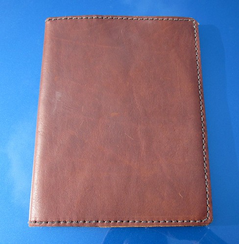
I'm a big fan of Renaissance Art's work. I have two of their composition book covers, one purchased back when it was a custom item (see my review here), and another purchased later, when they started making them as a regular item.

They are both beautiful, and have held up well. They're not for those who like their leather goods to look machine stamped, but for those who like a rustic, hard-working sort of cowboy/ancient times hybrid look, these are great.

A few weeks ago, Renaissance Art did an amazing thing. They basically *gave* away examples of their "passport" sized notebooks, for about the price of shipping, to get examples of their work out to anyone who was curious. They didn't request that we write reviews, though they always welcome feedback (and act on it, which is pretty awesome). I'm just excited enough to throw one out there of my own accord.

Turquoise--so pretty!

It is, like my big notebooks, beautiful, thick leather. It holds two passport sized notebooks (more on that in a moment), or a passport and a notebook, for the true travelers out there, or two passports, for the Jason Bournes out there (though if you're going to carry several at once, you may want to be careful where you leave 'em). The way it works: there's a doubled cord that runs through the middle and pulls through the decorative woven tube thingie on the side. You pull the cord back enough to loosen it, open one of your notebooks to the halfway section, and slip it under the cord. Then you pull the cord back through to tighten.


There's a video at the bottom of the product page on RA's site, if any of that didn't make sense. It works remarkably well, considering how simple it is. I'm guessing the white cord may get a little grubby with time, and over a whole LOT of time, it could wear out, but I'm guessing that won't happen anytime soon. It's sturdy stuff.

There are stitched pockets inside the front and back covers, big enough for folded receipts or business cards or other odds and ends.


It comes with one of Renaissance Art's blank notebook refills: heavy, hand torn paper with a simple linen cover. These are pretty rough around the edges because of the hand tearing, and don't have punched corners. They're also nicer (in my opinion) for writing or sketching with pencil rather than writing with fountain pen, as the standard paper (you *can* request other stuff) is pretty toothy.


I like it and will use it, but I will probably replace with my own refills after. Which brings me to a cool discovery.

When I was originally waiting for this to arrive, I had it in my head that it would be big enough to hold Field Notes and Moleskine cahiers. For some reason, that's about how big I thought "passport" meant. If I'd actually looked at my passport for two seconds, I'd have seen I was wrong, but I didn't.
When I first took this out of the envelope, I was disappointed. It's considerably shorter than a Field Notes notebook, so I figured I'd either have to order refills only from Renaissance Art, or learn to make my own refills--something I do want to do, at some point.

But then last night, it hit me: Scout Books are 3.5"x5 size! I thought just maybe that would work, and boom, yeah, they're perfect for one another! Which is awesome, really, because I really like Scout Books, and there aren't many covers out there that fit them well.


There isn't a huge amount of overhang on the cover's part, which is fine by me, but I figured I should point it out. It's just about flush.


So yeah, I got me a really beautiful little cover for carrying around a couple of Scout Books. And it's the same great leather I'd already loved, in a more fondle-able size. I may be buying more of these as gifts for other notebook lovers in my life.


Friday, August 16, 2013

Around Town: Finders Keepers

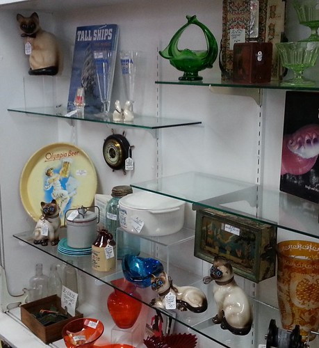
Vacation week continues! After several seaside adventures, yesterday I stayed closer to home. I went to one of my favorite coffee places (Mud Bay Coffee Roasters) to do some catching up on my journal, met a friend for a chocolate malt at Grandpa's Soda Fountain, and also wandered through one of my favorite Olympia businesses: Finders Keepers, a really interesting antique and collectibles store, with all sorts of nooks and crannies. It's made up of a whole bunch of different vendors, all with different focuses. Makes for a fascinating stroll, even if I don't end up buying much.
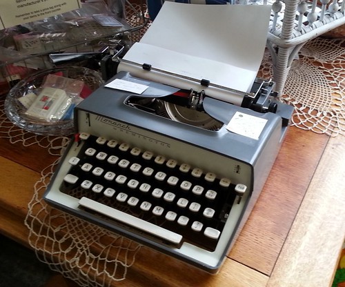
Quite a few typewriters this time, though pricey ones and nothing that totally grabbed me.

Monarch
Remington Monarch

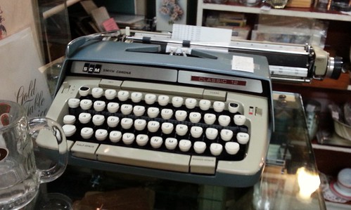
Classic 12
Classic 12

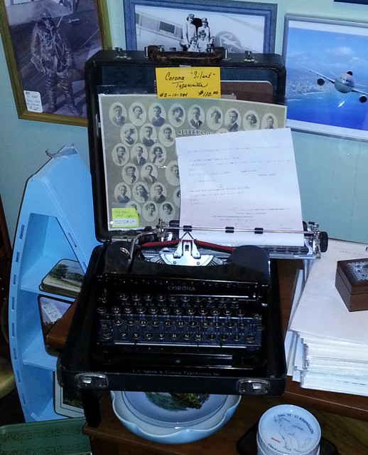
Corona
Corona in a dark back room--hard to photograph

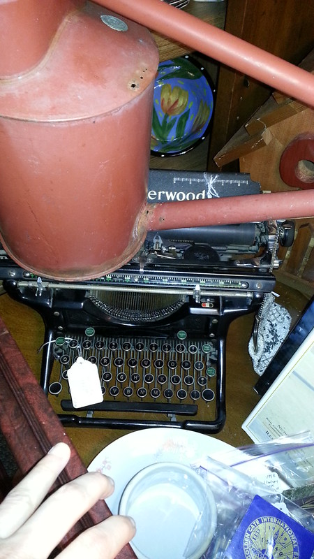
Buried Treasure
This poor beauty was practically buried!

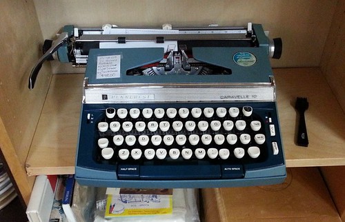
JC Penney Typewriter
This one appeals to me. Yes, it's just a Classic 12 (?) in a different suit, but a pretty snazzy suit. It's like an old car...

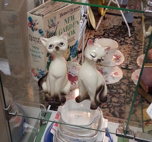
One vendor apparently has a thing for Siamese cats (as do I...)
Siamese
Siamese2

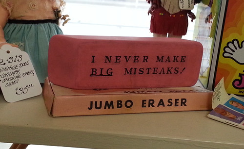
There are always some quirky novelty items.I should have put something with this eraser for scale. It's HUGE--maybe eight inches long? Just plain goofy, but it made me smile.
Giant Eraser

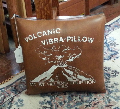
This, I don't even...
Vibra Pillow

Old Speed Ball sets, plus Eagle pencil leads...
Nibs and Leads

They also had stacks of variations on the old Chief tablets (and copycats).
Big Chief Tablet

This made me think of a certain Tacoma area typecaster...
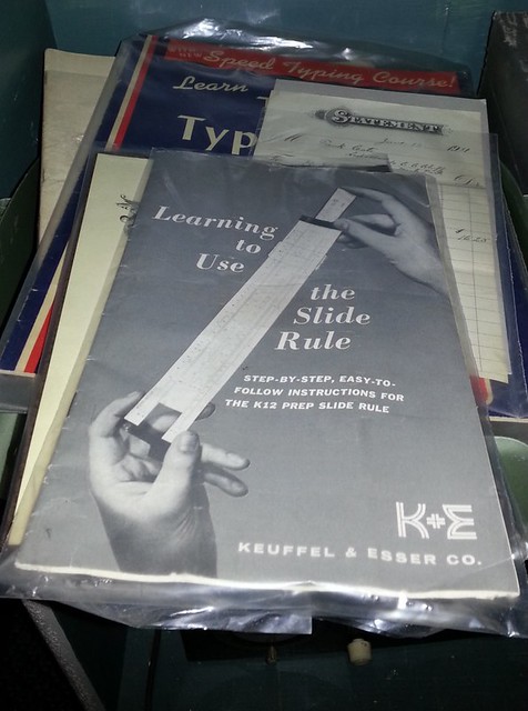
Slide Rule How-To

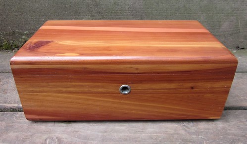
Fun trip, overall! And I didn't come away empty handed. I bought this plain little Lane cedar box. My Mom had one just like it (they must have made many thousands of them, I'd guess), and it's nothing fancy...but I love the smell of a cedar box!

IMG_1044

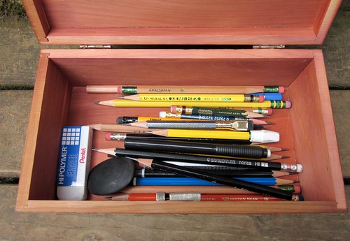
Also, as it turns out, it's a perfect fit for pencils!

IMG_1046

Tuesday, June 26, 2012

New Favorite Eraser: Pentel Hi-Polymer

Erasin'

(Yes, seriously, a post about erasers).

NEWS FLASH: Pentel Hi-Polymer Erasers are TEH AWESOME.

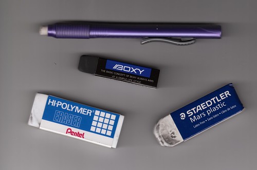
1. When I first encountered the Mars Plastic Eraser a few years ago, it was a revelation. An eraser that actually...well, erased? And did so without leaving smeary crumbs like ye olde gritty pink erasers of yore? Whoa. There's a reason these are one of the benchmarks of eraserdom.

Since my eyes were opened to the possibilities, I've picked up a few other eraser varieties.

2. The Papermate Black Pearl (out sick the day the class photo was taken) is a great shape--if you use a sharp edge, you can get into pretty small spaces, but used lengthwise you can go to *town* with the thing. And being black, it doesn't acquire the grungy...um...patina of the white erasers. It does, however, produce more and messier residue than the Mars.

3. The Pentel Clic erasers get into small spaces and erase almost entirely--I think they're the same material as my new favorite eraser, actually. For things like math problems where you might need to erase one tiny character at a time, I imagine these'd be the way to go. Because they retract, they also can be kept pretty neat and clean--I keep one in my purse partly for this reason. But I like the solid, stolid simplicity of plain old block erasers, and (how shall I put this?) the way these sort of squish when you press down on them unnerves me.

4. Awhile back I picked up a Uni-ball "Boxy" eraser on a whim when placing a Jet Pens order, and this may be *the* primo eraser. Black, so it doesn't show graphite, and as you erase, the little shreds roll into a sticky little ball all by themselves, so they're very tidy. They also have that somewhat enigmatic little slogan: "The basic concept of Boxy always aims at a simple life style." Mmkay. Good to ponder. And, most importantly, wow they work well, even on dark and smeary pencil. They are, however, small, difficult to find, and rather expensive as erasers go. Also they are soft enough to damage by hard use if you aren't careful.

5. But the Pentel Hi-Polymer ZEH10 may be the Baby Bear's Chair of graphite erasers. Not only do they have a nifty '80s sort of style goin' on with the print on their little sleeve thingie, they're also large, long lasting, and work pretty much like the Boxy but are less easy to damage. As a bonus, they're available lots of places. I bought three of these bad boys for less than two bucks at Wal-Mart. I'm sold.

Wednesday, February 29, 2012

Places to See #2

This week's passel o' links I found entertaining or of interest:

► The oldest recorded melody? I find this one particularly fascinating, even a bit spine tingling. If this is anything *close* to accurate, we're hearing music that fell on the ears of the ancients, eons ago.

► Interesting glimpses of New York diaries from all different time periods and very different personalities...as always, I'm intrigued by variances in handwriting and style.

► 10 words that need to die immediately. (They do, they do!)

► The Lamy Safari color of the year, 2012.

► Cats as fonts--cute. (Thanks to notagain at Manual Entry for this one...)

► Guitars in space!

► Speaking of guitar, wanna buy a guitar boat?

► How to make a duct tape rose. Well, *I* thought it was cool!

► And this round's "just because" entry, cat caught barking...

Sunday, February 12, 2012

Renaissance Art Leather Composition Book Cover #2

Renaissance Art Leather Composition Book Cover
I've already been carting this around a few weeks, so it has a bit of "character" already!

This is now a two Renaissance Art composition book cover household.

Renaissance Art recently began carrying composition book covers as a standard item, and offered an introductory discount. Since I typically have at least two comp books going at once, one as a journal and one for other writing, and since I'd already been thinking about getting a simpler second one without the wrap and tie, I jumped on the offer.

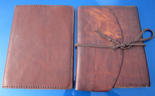
Two different leather notebook covers
The two covers compared

I considered going with one of their "Rustic Elegance" leathers this time around: these are thinner, and come in all sorts of beautiful colors (from the on-screen swatches, I'm particular fond of the Twilight Blue and the Merlot). They make for a sleeker, slimmer, more civilized looking cover. But in the end, I chickened out and went with what I know: the same thick, rustic brown leather as my other Renaissance Art cover. It's slightly less expensive, and it is bombproof. This leather can also be "distressed", which I find amusing and entertaining. The new notebook cover doesn't seem to change as much with this process as the old one does...not sure if this is age difference, or just variation between two pieces of leather. Still, it's rather fascinating.

What "distressing" does to the leather.
Close-up of the old cover--the top portion of the flap has been mangled a la the video I linked to above, while I smoothed out the bottom portion and left it as is.

My new cover came in a matter of just a few days, which was pretty nifty. And there isn't a great deal for me to add to my original review of the first cover. The leather feels and smells great, the cover fits well, and while it doesn't have the classy, luxurious appearance of something like a Levenger Circa Bomber Jacket folio, I like the rugged, homespun look of it. And like my other cover, this will likely outlive me.

Inside of cover
Inside, showing how the notebook fits inside...sorry for the funky coloring on this photo...

I like it. Renaissance Art makes good stuff. (Or, for the British, Renaissance Art make good stuff.)

Tuesday, September 27, 2011

A Beautiful Mess of Pencils

The positive side of my NaNoWriMo transcription project (aside from the fact that I now have a digitized NaNo novel, such as it is and what there is of it) is that it reminded me of just how much fun I had playing with pencils that month--lots and lots of pencils, lots and lots of hours spent with them. I've been more or less fixated on the fountain pens lately as I'm working my way through all my pretty ink samples from Goulet Pens.

But last night, I got the pencils out and started working on a short story idea. The wonderful tactile realness of pencils combined with their optional impermanence makes them one of my most confidence inspiring writing technologies. Love 'em.

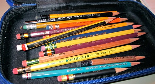
How's this for a lovely cluttered autumn palette of pencils? (Please to ignore the eraser crumbs and cat hair...)

Pencil clutter

Pencils of the evening yesterday were the General's Semi-Hex (love those: dark, *and* they hold a point forever) and the General's Layout. Unintentional theme.

No real point to this blog post. Except gratitude, I suppose! Life is good.

Sunday, August 07, 2011

Find of the weekend: Sheaffer Cartridge Pen

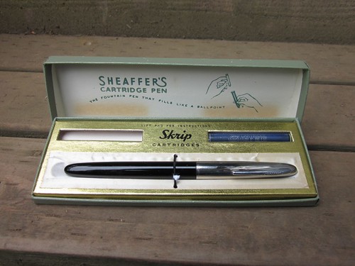
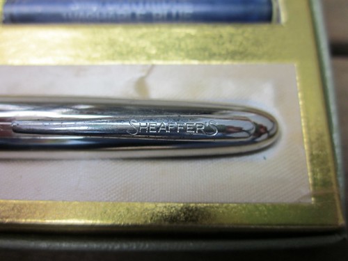
I went to the antique mall in town yesterday for the first time in awhile (for those of you at the type-in, think a bigger, more cluttered and varied sort of Deluxe Junk, with lots of books and kitchen stuff in addition to furniture and what-have-you).  It's called Finders Keepers.  Love that place.  They occasionally have typewriters, but this time, the only ones there were electric.  One of the electrics had a really interesting san sarif typeface, but it was still electric, plus $69.  Not my thing.  However, I did make my first ever in-the-wild more-or-less-vintage pen purchase: a Sheaffer "Cartridge Pen". I figured it was an acceptable risk, since there wasn't a filling system likely to need restoration. It's a lower end pen, nothing fancy, but still...cool!


The cap is a bit tarnished, but otherwise it seems in decent condition. Friction fit cap.


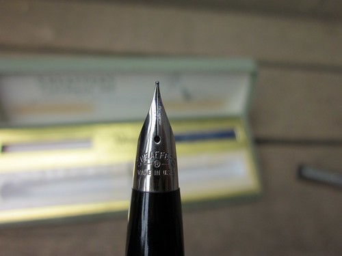
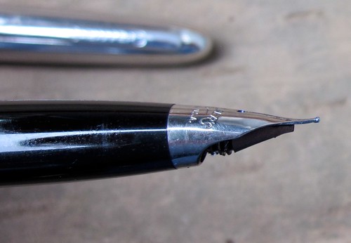
It has a conical nib, which the nice folks over at Fountain Pen Network inform me is a "Triumph" nib:


(Please ignore the capitalization weirdness in the title of that thread.  Ugh!)  It has a little tip-up at the end, which I'm told is normal.  And it's a pretty nice writer--fine, but fairly wet, and very smooth if you hold it at just the right angle (something I'm still learning to do).


The cartridge missing from the box slot on the left was still inside the pen. I rinsed the pen, added a little water to the cartridge, popped it back in, and the little guy fired right up! It was a little scratchy, though, so I refilled a cartridge (via syringe) with Noodler's Blue-Black, which works better.  Eventually I may try to find a converter for it, though I'm not sure modern Sheaffer converters will work.  I have a feeling they may be too long.

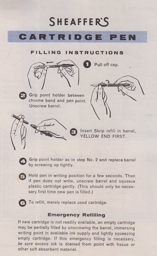
One of the reasons I suspect this was early as cartridge pens go is that the instructions include info on essentially using the cartridge as a converter in an emergency--apparently assuming most folks would have easy access to bottled ink, but not necessarily to cartridges!


All in all, not bad.  For twenty dollars, I may have overpaid compared to some on-line sources...but hey, instant gratification!

Saturday, April 30, 2011

Another Saturday Ramble

It had been a few months since I last checked out the downtown antique store and generally rambled around town, and today was a lovely sunny day, and so...why not?  This time around, I was on the prowl for old pen points/nibs or pen holders as well as typewriters.  Did I find any?  Well...yes and no.

First up was the antique "mall" in downtown Olympia: Finders Keepers.  As I keep saying, I really like Finders Keepers.  I don't always buy anything, but I always enjoy looking around.  There are lots of little divided cubicles with a whole variety of different goods.  As soon as I walked in, I spotted this:

Ooh, shiny!

It looks to be in pretty nice shape, but at $125, well out of my range.

The only other typewriter-like object at Finders Keepers was this odd little adding machine.


There were also a few inkwell type things, not in great shape, and this bottle of Red Quink, which I was mildly tempted by, but passed on.

I realized *after* I got home that I'd photographed the Spanish side. Ah well.

I didn't find any dip nibs though. Or any other writing related items, with the exception of this little portable desk, which I'm still thinking about going back for at some point.

Twenty-five dollars. It's fairly roughly made and nothing fancy, but I couldn't help daydreaming about finding an inkwell that would fit that hole, and keeping all my notebooks and supplies inside. We'll see.

After Finders Keepers, I finally made it to the antique store where notagain found his Royal. It's called The Rusty Roostery, and they're open rather odd hours...not until one on Saturdays. There were no Royals in evidence today, but they did have an Olympia SG-1 for $30...

It's verrrrry filthy and fairly rough, and I didn't do much testing of it...but might be worth a look to someone.

I did break down and buy some Quink at Rusty Roostery. They had turquoise Quink. I cannot resist turquoise.

It isn't a full bottle and the label and box are pretty stained with old ink, but it was cheap and I figure I can use it with the dip pens, just for play. I think I'd be scared to put it in my fountain pens. It's a neat old bottle, though!  They also had a single dip pen--a Speedball C nib of some sort (very battered) in a Bradley of Vermont holder (more battered still).  Neither looked usable, so I left them where they were.

I also found something only my family would be likely to get excited about: a copy of the same desk encyclopedia set we used for word games and such for years growing up, tossing the books back and forth during rounds until at this point they've become battered almost out of existence.

I had to buy 'em.

And then I came home to find a sampler of dip nibs from Speculator waiting in my mail box, and have been happily making inky messes for the past hour or so. What a day!

Saturday, October 02, 2010

Paperback Throwdown

Something just a little out of my usual realm today: a journey through some paperback cover art.

I kinda sorta collect old mysteries, particularly Agatha Christie, Dorothy Sayers, Rex Stout, and a small handful of others, plus a few sci-fi books here and there. Most of these books are paperbacks, because a) I'm cheap, and b) they tend to be far more common than hardback editions. Paperbacks aren't as durable, of course, *but* they do have one bonus feature: while hard cover volumes tend to have long ago lost any dust cover and thus their original artwork, paperbacks can't ditch the original cover, for better or worse. They're stuck with their original artwork, cheesy or lurid or bizarre as it may be.

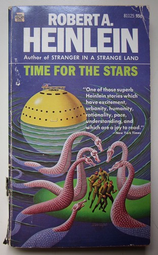
Old sci-fi paperbacks in particular are known for being...odd. There are many with strange, brightly colored covers, often with motifs that seem to have no real connection to the actual story. Heinlein covers tend to be especially odd, in my experience. This particular one is tame compared with the last library book of his I checked out. Woo-hoo for pink sea-dragons!
Time for the Stars

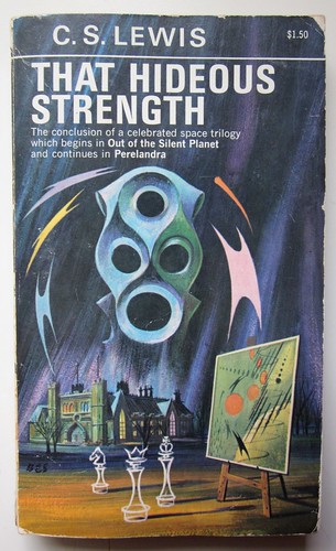
Then there's C.S. Lewis' That Hideous Strength. I've read this book practically every other year since high school, and I still couldn't tell you what the cover is supposed to be about. I mean...what's with the painting of what is apparently bouncing orange balls and bolts of flying black lightning? No clue.
That Hideous Strength

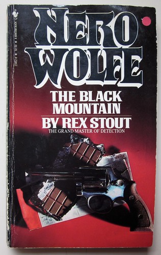
Mysteries seem to do different things by decade and depending on the publisher's whims at that point in time. There is a whole series of Nero Wolfe books with cover art that could *all* be titled "Still Life With a Gun". Usually a revolver, but not always. They liked to mix things up, those cover artists of old.
Homicide TrinityIn the Best FamiliesToo Many Women

My favorite in this series: revolver plus chocolate. Nice.
The Black Mountain

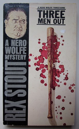
There's another whole series of Nero Wolfe books with gobs of fake blood as a major component of every single cover picture. Apparently there was a special on red paint that decade. Or something.
Three Men Out

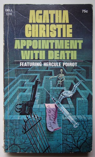
Many of the older Agatha Christie covers go along with the classic Still Life With a Gun motif, though in painting form rather than photography. And no, I cannot explain the GIGANTIC syringe and watch and revolver on Appointment with Death's cover. Or maybe they aren't gigantic, in which case that's a very tiny maze and skeleton and gate and trees. I tried to figure it out, but it just gave me a headache.
Appointment With Death

Revolver and dagger and jooolry. And burning candle. All carefully balanced without falling over. And without setting the house on fire.
Double Sin

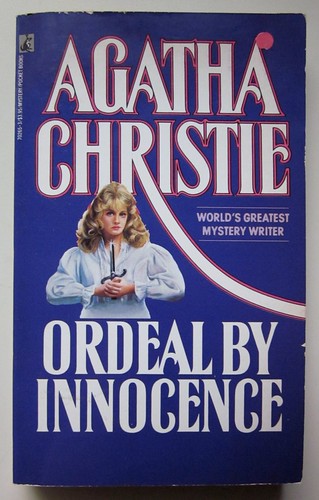
Because of the cover art, I sometimes end up with two copies of the exact same book. This is partly because it means I can't remember if I already own a given book, since they look completely different, and partly because it's just fun to compare. For example, here's an old copy of Agatha Christie's Ordeal by Innocence. It's very worn, but if you look closely, you can make out the sort of 1930s style car, the woman's elegant hair style.
Ordeal by Innocence

And, for contrast, another edition. Can you guess which decade this is from? (Nice hairdo, huh?)
Ordeal by Innocence (80s)

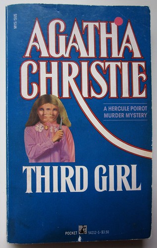
And then there is this little gem, one glimpse of which is sure to make a teetotaler of even the hardest drinking guest.
Third Girl

A closeup of the scary cover thing. Isn't she lovely?
Third Girl Scary Closeup

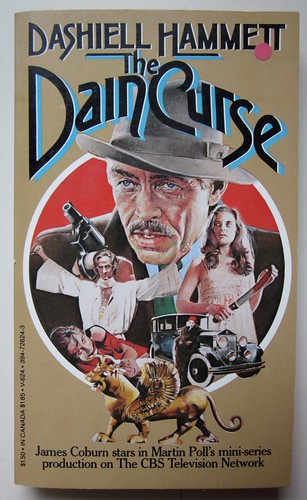
I'll finish off with a Dashiell Hammett cover, which I love just for its complete over-the-top-ness.
Dain Curse

It's like an old movie trailer in one image: "Guns! Girls! Fast cars! Kidnapping! MURDER!!!"