Showing posts with label review. Show all posts

Wednesday, December 02, 2015

Three Inks: Terre de Feu, Cactus Fruit, Scabiosa

As I'm going through these Goulet Pens ink samples, I thought I'd toss out a few little mini-reviews! So here you go. My opinions only, and your mileage may vary.

1. J. Herbin Terre de Feu

I really, really wanted to like this ink. In a very wet writer, I think it'd be quite nice, and it does have interesting shading. However, like many J. Herbin inks, I find it too dry for my tastes, and not saturated enough. In a less than fire-hose-ish pen, it comes out a pale pinkish brownish orange, which just doesn't appeal to me.

Ruled out.

2. Noodler's Cactus Fruit Eel

This is an ink I like more than I should probably admit. I mean, it is BRIGHT. Obnoxiously bright. It is not really a "grown up" color. But ooh, so cheery! It isn't a super duper match for more absorbent papers (the "eel" lubrication factor, which is supposed to make pistons work a bit better, seems to make ink spread and feather a bit more than standard), but it is a pleasure to write with.

This one goes on my wish list.

3. Rohrer and Klingner Scabiosa

Scabiosa sounds gross, no? But it actually just means honeysuckle. What a difference a language makes. This is another ink I wanted to like: it has an iron gall component, which makes it somewhat water and fade resistant, and in the right pen, it might be kind of nice. However, in my fairly dry-writing modern converter pens, it felt...like writing with a toothpick. *shudder* And the color ends up being a pale imitation of itself. I think. Reviews of this ink vary so much, I'm not completely sure what color it actually is--I expected a dusty purple, but it looks more...pinkish grey.

Ruled out.

Friday, June 20, 2014

Review: rOtring Rapid PRO 0.5mm Mechanical Pencil

Hey, I've never reviewed a mechanical pencil here, have I? Let's have "Things that may annoy both the wooden pencil diehards and the fountain pen folk" for $100, Alex.
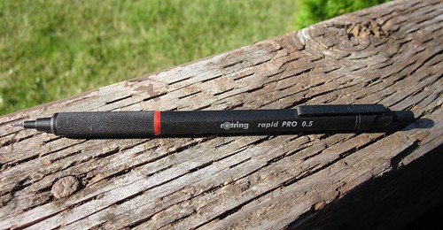
Rotring Rapid PRO

Much though I like those other things, there is something to be said for mechanical pencils when it comes to fuss-free on-the-go writing, and this has been my primary for that role over the last six or seven months. It went with me to Wintergrass, and has been my companion on many a coffee house jaunt.

Last things first: I flippin' love this pencil. A goodly percentage of my current large-work-in-process (Mind Jinx) came out of this pencil. I could dedicate novels to this pencil.

I will, however, try to remain objective.

1. Appearance:
This is a classy looking item. My one and only quibble is that the version I have (black--there is also a silver flavor) tends to get a little grungy looking over time as the knurled grip picks up dust and whatnot. I can't say for *certain* that the silver would be better in this regard, but it seems logical. The black does, however, contrast beautifully with the rOtring red ring, and has a nice understated stealth appearance to it outside of that splash of color. The paint has held up well to abuse (read: being carried unprotected in bag and purse and bumped about on tables and desks). The body is subtly hexagonal, which--along with the clip--makes it less apt to roll when it should not.
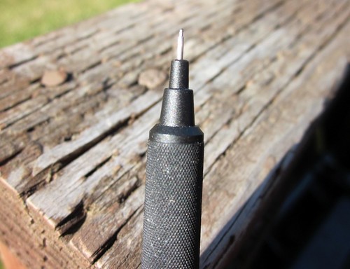
Lead Sleeve
2. Grip:
The knurled grip is rough enough to be reassuringly sticky, but (unlike many drafting pencils) not so rough that it will sandpaper away your hard-won writer's callus. Keep in mind that I am not a draftsman, and use this strictly for writing: it could possibly be a little *too* smooth for some drawing purposes. Even for writing, I wouldn't mind just a touch more roughness, but it gets the job done. The grip is of a pleasant girth: more than a wooden pencil, less than your average gel pen.

3. Balance:
This is a relatively heavy pencil at 24.2 grams by my little kitchen scale (in contrast, I weighed a Pentel P209, and it weighed just under 9 grams). It doesn't feel clunky, however. The center of balance is almost exactly in the middle--just a smidge closer to the tip than the tail. It feels about perfect to me. I have a Pentel Graphgear 1000 I like a great deal, but it is back heavy, and that gets tiring after awhile. This one doesn't fight me either way.

4. Retracting tip:
THIS IS IMPORTANT TO ME. I don't wander around with a pocket protector, and I don't always feel like carrying a whole pencil case. I can quickly and easily put the point of this pencil away for its safety and mine. It doesn't have any fancy auto-retracting mechanism: you just hold down the button at the back of the pencil and then release it while you press the tip gently against your notebook/table/finger. I like the simplicity. Less to break.

Before the Rapid PRO arrived, I worried there would be a lot of give or wobble in the lead sleeve, or vibration while writing. I have little tolerance for this. As an example, I know a lot of people love Uni Kuru Toga mechanical pencils for the way they rotate your lead for you and keep presenting you with a clean, sharp edge, and while in theory it sounds cool, I find the slight give irritating enough that I haven't used my Kuru Toga as much as anticipated. This pencil, on the other hand, is pretty solid.
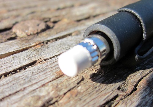
Eraser
My little point-and-shoot camera steadfastly refused to acknowledge the existence of the eraser, but you get the basic premise.

Other details:
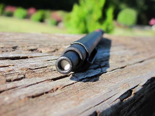
The eraser is found, as you'd expect, behind the little back cap. There's actually a hole through which you can see the white eraser peeking through--I would prefer a solid cap, but whatever. The eraser itself is par for the course for quality mechanical pencils: i.e. you *could* use it in a pinch, but it wouldn't go very far, and I much prefer a separate Mars Plastic or a Pentel Clic Stick.
Eraser viewed through end cap
Eraser, as seen through the back cap

To load leads, remove the little eraser and drop them in the back end of the pencil. Again, pretty standard. It's a fairly small lead chamber, but my 0.5mm model will hold a half dozen or so leads in a pinch. The lead feeds out at a nice rate--doesn't require extra clicks, or overadvance and cause breakage.
Clip
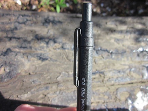
It'sa clip.

I don't use the clip much, but it appears durable and without any bits that catch on things they shouldn't.

Overall impression:
As I said, I really like this pencil. The balance works perfectly for me, the retractable tip means I can take it anywhere without worries, the grip isn't bad, and the whole thing just screams quality. I currently keep mine loaded with plain old Pentel Super Hi-Polymer lead (B grade), and it is a pleasure to use.

Pros:
• Just about perfectly balanced, at least for plain writing.
• Retractable lead sleeve/tip.
• Purty.
• Comfortable heft and solidity.
• Knurled grip adds stability.

Cons:
• The black version can get a little grungy looking.
• Lead sleeve is fragile, from all I've heard, so make sure you get into the habit of retracting that point when it isn't in your hand!
• Don't expect the eraser to do much for you.
• Knurled grip could be a little grippier.
• Spendier than the Pentels and Bics at Wal-mart. (I paid about $30 for mine on Amazon back in November. YMMV.) That said, it should last pretty near forever with a bit of care.

Specs:
Weight: 24.2 grams (empty), at least according to my cheapie scale
Length: Approximately 5.7 inches (14.5 cm / 145mm) long
Diameter: 9mm
Body material: Metal, but I'm not sure what type--if you know, feel free to fire off in the comments!

Monday, October 21, 2013

Quick and Dirty Review: Kum 1-Hole Long Point Sharpener

IMG_1077

I really wanted to like this pencil sharpener.

Since I primarily use my pencils for writing, long points are my preference. They allow more precise writing, and let me write for longer stretches between sharpenings. This is why I like the Classroom Friendly Pencil Sharpener (CFPS hereafter): it gives you seriously long writing points, without breaking the lead or leaving it ragged. It has me very, very spoiled.

Get the point?
This photo brought to you (mostly) courtesy of the Classroom Friendly Pencil Sharpener...

There are a few reasons I wanted the Kum as an option:

  1. The CFPS leaves bite marks on your pencils. If you look up close at my pencil photos, you'll notice all the little pinprick holes left by the gripping mechanism*. I've learned to live with them, since I've found no other pencil sharpener that does as nice a job on the writing points (including a fancy Carl), but it would be nice to have another option for the most premium pencils.
  2. The CFPS isn't exactly something I can toss into my book bag for coffee shop runs.
  3. You can be a bit more conservative with a hand held sharpener: only shaving off juuust enough to give you a point and no more. Granted, the CFPS is pretty good about stopping as soon as you have a sharp point, but again, for the most premium pencils (or stubbies), I thought a good hand held sharpener might be nice to have.

I've tried Kum's two step long point sharpener. It's a pretty neat concept: the first step clears some of the wood away, the second sharpens the exposed lead to a nice long point. But...in practice, I found it finicky and a bit unpredictable, and broke more lead than I could happily live with. I hoped this new sharpener would be the answer to my wishes, especially since I really like my simple little brass Kum, and this seemed to be almost the same thing but with a longer resulting point.

Except...it hates me. I either mangle the lead or break it off entirely. Every...single...time. Even when I do get a semi long point, it's warped and brittle and snaps the instant I try to use it. Wah. So I guess I continue with my current approach, which is to sharpen only at home or at the office, and carry a boatload of pencils with me so I don't need to sharpen on the go. Bonus of this approach: validish excuse to carry a boatload of pencils.

But I'm saddened, nonetheless.

IMG_1079
Attempted close-up of an attempted long point...

*One thing that helps a smidge with the aesthetics of the bite marks: I try to always face the pencil the same way when sharpening, e.g. with the text upright, so at least the holes line up...

Monday, August 05, 2013

Other Stuff I Like: Klean Kanteen 16 oz. Insulated

Klean Kanteen Full

I realize this is out of my usual scope, but caffeine addiction seems to go side-by-side with writing material obsession, no? So here we are.

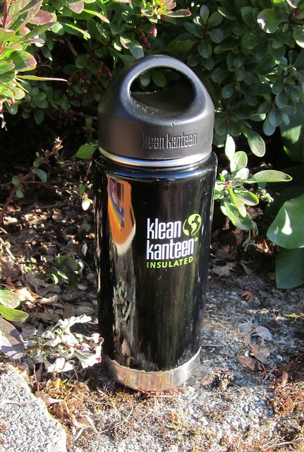
Not long after the new year, I acquired an insulated 16 oz. Klean Kanteen. This is a heavy-duty stainless steel double-walled vacuum insulated tumbler. Now that I've spent over six months putting it through the wringer, I feel qualified to share my experience.

NOTE: Keep in mind that this has been in (rough) daily use for pretty much that whole period, so this is not your usual pristine review model.

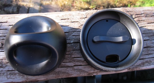
You can get these with a variety of different caps and lids. When I ordered mine, I opted for a "coffee set" that came with both a solid, leakproof loop cap and a sippy "cafe" cap.

Lidz
Left: loop cap Right: cafe cap

Loop Cap Interior
The loop cap is lined with steel, so no plasticky flavors in your beverage. Any dust and gunk is my own, not Klean Kanteen provided.

I use both caps on a daily basis. Typically, I'll make my coffee in the morning and put on the loop cap for the journey to work, so I can toss the bottle around without worrying about spillage. I carry the cafe cap in my lunch bag and switch to that once I get to work, enabling me to sip without having to fiddle with the lid each time. Now...I realize there are fancy caps that have press and seal gadgets so you can sip and then close them. However, a) I am the queen of forgetting a dirty coffee cup somewhere on Friday and not getting around to cleaning it until later, and some of those cups require a mechanical engineering degree to disassemble for cleaning and reassemble, and b) the more parts there are, the more likely it is something will break or go missing. I love the simplicity of the Klean Kanteens.

Another note: if for any reason a cap wears out or gets lost, Klean Kanteen sells replacements.


As a bonus of sorts, the cafe cap resembles a certain Star Trek character. Thanks to Michael Clemens for the meme image made after my initial comment.

Speaking of cleaning, there's a reason for the Klean in Klean Kanteen. Everything about these is easy to get to and scrub. There are no hard corners--even on the cap threads--or places where crud can build up. A bottle brush and possibly an occasional vinegar and baking soda treatment is all you need to keep them sparkly.

Threads
Close-up of rounded threads

Disassembled Cafe Cap
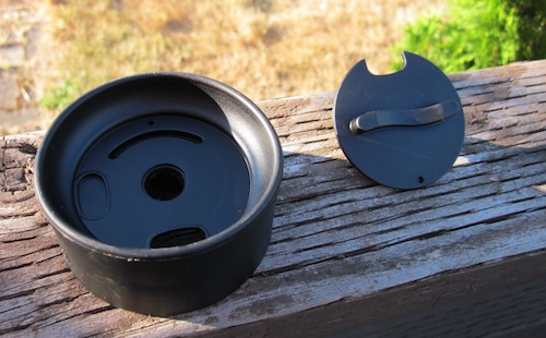
The cafe cap also comes apart in two pieces to make it easier to clean.

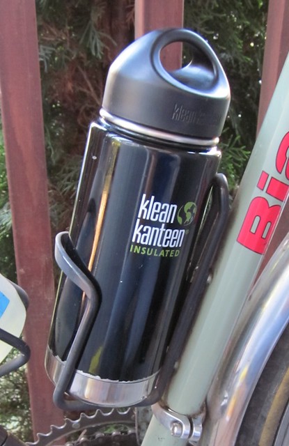
Bonus feature: Although I didn't buy it for this purpose, I quickly discovered these fit in a standard bicycle bottle cage!

Kanteen on the Bike

Considering I've spent years trying to figure out convenient ways to bring coffee to work when on the bike, this makes me extremely happy.

So...summation of the pros:

1. Easy to clean.

2. Choice of lids (flexibility), which are easy to replace if lost or broken.

3. Fits in bike bottle cage.

4. Customer Service! The Klean Kanteen people obviously feel passionate about their products and stand behind them all the way. When I ordered my first Kanteen, I was a little concerned to discover it made a light rattling noise if shaken (which I typically do to check coffee level, for those wondering why I'd be shaking my cup). I wasn't sure what this meant, so I wrote to their customer service. I got a rapid and friendly response explaining the possible causes, and offering a replacement if I felt it warranted. I ended up accepting the replacement, if only for my own peace of mind. A few photos later, they let me know the new Kanteen was in the mail, and that I could keep the original for use or recycling. (It ended up functioning OK. This is it, in fact, so now I have two.) The experience left me pretty stunned, to be honest. That level of service is hard to come by these days.

Cons (there had to be a few):

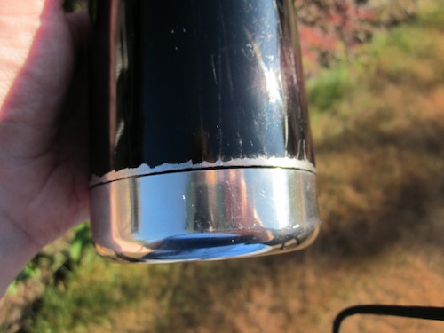
1. I would recommend that those who use their Klean Kanteens in the bottle cage either opt for one of the brushed stainless steel models (no paint) or a less scratchy bottle cage. My poor Kanteen has developed rather more "character" than perhaps it deserves.

Scrapes
Scratches, paint chips, my fault...but something to be aware of.

2. The small top diameter can be an issue. It is one of the things which makes it fit so beautifully in a bottle cage, but it does mean your average tea basket won't fit, so if you (like me) like to brew from loose-leaf tea leaves now and again, you may find yourself frustrated. You also can't use an Aeropress directly into it. The Melitta cone, #2 sized version (my usual brewing method) works fine, however.

3. They're pretty pricey compared to the competition, though you *can* find sales here and there.

4. One other minor possible quibble: although coffee remains tastily temperatured until close to lunchtime, I would say overall this doesn't keep things hot and cold *quite* as long as Thermos containers. When I cooled both my old Thermos tumbler and the Kanteen with tap water and then added the same number of ice cubes to each, put the lid on them, and left overnight, the ice cubes in the Kanteen were a little smaller come morning. I don't have detailed measurements of the difference, which likely wouldn't affect normal usage, but I suppose if you spend time out in the cold or heat in the field, it's worth consideration.

Completely unsolicited, no financial interest and all that. I just think these are great products deserving of praise! I hope to add a plain, single-walled water bottle Kanteen to my arsenal at some point.

Specs (per manufacturer's site):
Capacity: 16 fluid ounces (473 ml)
Weight: 8.75 ounces (w/o cap)
Size: 7.25" H (w/o cap) x 2.9375" W
Opening diameter: 2.125” (54 mm)
18/8 food-grade stainless steel

Product page on manufacturer's website: http://www.kleankanteen.com/products/insulated/klean-kanteen-insulated-16oz.php

Wednesday, November 21, 2012

Verdict: Blueline A9 - NOT Fountain Pen Friendly

Mini-review: I just finished off a Clairfontaine notebook I'd been using as a journal (in pencil, for those keeping score at home), and started in on a Blueline A9 I've had around awhile. In case anyone was wondering, the Blueline A9 notebook is very far from fountain pen friendly. Much feathering and bleeding.

For the record, that's the *back* of a page...mucho bleed-through! Yikes...

Considering the 30% recycled paper, I guess I shouldn't be surprised, but it's still disappointing: there's so much to like about this notebook otherwise. It's basically composition book sized (my favorite) with a nice hard cover and details I like a lot: stickers for labeling for archival purposes, and spaces on the pages for the date and page number. But...bleh.

I'll stick it out, but can only use one side of the page unless I use pencil or ballpoint.

Thus far the best bet for an inexpensive, fountain pen friendly journal still seems to be my el cheapo Made in Brazil Wal-Mart composition books...those work with almost anything. And they're about a quarter apiece at back to school time. I wish I'd bought a lot more back in the good old days when they didn't have floppy covers, but I guess you can't have everything.

Sunday, June 10, 2012

Musgrave Test Scoring 100 Pencil

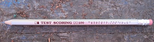
Musgrave Test Scoring 100 pencil

I have a number of well-liked pencil varieties...more than I should probably confess to. Many or most have been heavily reviewed elsewhere. So today...I want to stick in a plug for a pencil that's a bit of an underdog: the Musgrave Test Scoring 100, made right here in the US in Shelbyville, TN.

I'm only aware of a few reviews--here and here, for example. And I'll say up front, I'm not an experienced, competent reviewer like these folks. You should almost certainly trust their reviews (rather lukewarm or negative as they are) over mine. I take no responsibility for consequences stemming from my words here.

That said, I would like to go out on a limb and state another thing up front: I flippin' love these pencils.

I even love their appearance: that thin, somewhat chintzy silver-colored paint, for one. It warms the heart of anyone who has ever used silver spray paint to make cardboard robots or other such backyard crafts. It's so wonderfully tacky. And the unapologetically plain pink eraser and unpainted ferrule also tug at my heartstrings. The whole thing reminds me of some sort of homemade toy, which makes me smile. They're so ugly, they're adorable.

But it's a pencil: a writing instrument, first and foremost. How does it write?

Musgrave Test Scoring logo

As the little icony graphic surrounding the pencil's name illustrates, these pencils were designed to be used for filling in the little bubbles on multiple-choice tests: they are meant to make a good, solid, dark mark, easily read by those Scantron machines. And making dark marks is what they do. They are a little on the soft side, and slightly waxy. Some dark pencils can be a little powdery in feel, easily worn down and somewhat prone to crumbling. These are less so, and less prone to smearing as well, but if you look very closely at the dark writing, you can see a bit of texture to it. At a microscopic level, it may not cover the paper quite as thoroughly as the more powdery pencils.

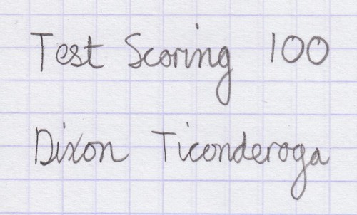
Test Scoring writing sample
Hard to see from this scan, but it's actually somewhat darker than the Ticonderoga, but perhaps less sharp

Test Scoring Close-up, showing texture
Somewhat blurry close-up attempt to show the texture I'm referring to.

They do wear down a little faster than at least some HB pencils--they're more akin to 2B grade, I'd say--but aren't unreasonably fast-wearing. And I've had zero issues with lead breakage. Most importantly, I just plain love the way they feel on the page. They require very little pressure, and they are very smooth, yet...chewy. Chocolatey. I don't know quite how to put it. It's not the almost chalky smoothness of, say, a California Republic Palomino HB, but something slightly more substantial. It almost reminds me of the silky-yet-springy feel some mechanical pencil leads have, to my mind. Others have stated they found the lead scratchy, which makes me question my sanity...but what else is new? Another point in their favor: the leads have been perfectly centered in all I've sharpened so far--poorly centered leads being a serious pet peeve of mine. And the pencils sharpen easily and cleanly. I believe the wood is either cedar or basswood. They don't have a strong aroma.

Aside from the slight texture to the writing they produce, their other potential downside is the pointiness of the corners. Unlike vintage pencils, most pencils these days are actually semi-hexagonal rather than straight hexagonal: the corners are softly rounded off. Musgrave doesn't do this. These corners are straight cut. They aren't sharp, but they're definitely more cornered than your average modern pencil shape. This looks classy and makes them reassuringly grippy at first, but during long writing stints, you start to notice the edges, and not necessarily in a comfortable way. On the bright side, they will build up your writing callouses and help you feel like a serious old-school writer, if this is your dream.

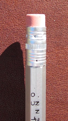
Test Scoring Ferrule

The eraser is...your average rubbery eraser. It is no worse than most attached erasers: i.e. it will do in a pinch, but I vastly prefer my Papermate Black Pearls and Mars Plastic erasers. The ferrule is plain, unmarked metal.

From what I can determine, for standard consumers, these are most easily available via Pencil Things--either directly from their website at PencilThings.com, or (in packs of three dozen) via their store on Amazon.com.

Test Scoring Smear Test
Smear test--it does smear a tiny bit more easily than a standard Ticonderoga HB

And now, one of these days I need to get my hands on some Musgrave's HB pencils!
Sunday, February 12, 2012

Renaissance Art Leather Composition Book Cover #2

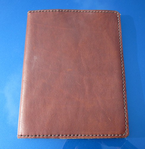
Renaissance Art Leather Composition Book Cover
I've already been carting this around a few weeks, so it has a bit of "character" already!
This is now a two Renaissance Art composition book cover household.

Renaissance Art recently began carrying composition book covers as a standard item, and offered an introductory discount. Since I typically have at least two comp books going at once, one as a journal and one for other writing, and since I'd already been thinking about getting a simpler second one without the wrap and tie, I jumped on the offer.

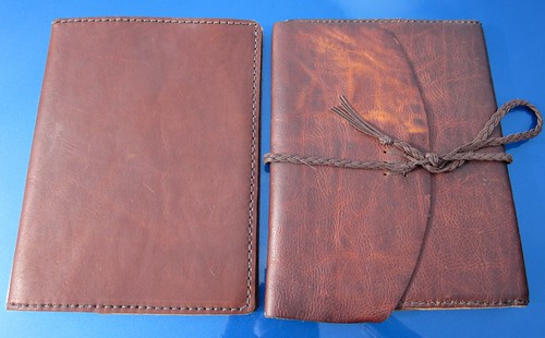
Two different leather notebook covers
The two covers compared

I considered going with one of their "Rustic Elegance" leathers this time around: these are thinner, and come in all sorts of beautiful colors (from the on-screen swatches, I'm particular fond of the Twilight Blue and the Merlot). They make for a sleeker, slimmer, more civilized looking cover. But in the end, I chickened out and went with what I know: the same thick, rustic brown leather as my other Renaissance Art cover. It's slightly less expensive, and it is bombproof. This leather can also be "distressed", which I find amusing and entertaining. The new notebook cover doesn't seem to change as much with this process as the old one does...not sure if this is age difference, or just variation between two pieces of leather. Still, it's rather fascinating.

What "distressing" does to the leather.
Close-up of the old cover--the top portion of the flap has been mangled a la the video I linked to above, while I smoothed out the bottom portion and left it as is.

My new cover came in a matter of just a few days, which was pretty nifty. And there isn't a great deal for me to add to my original review of the first cover. The leather feels and smells great, the cover fits well, and while it doesn't have the classy, luxurious appearance of something like a Levenger Circa Bomber Jacket folio, I like the rugged, homespun look of it. And like my other cover, this will likely outlive me.

Inside of cover
Inside, showing how the notebook fits inside...sorry for the funky coloring on this photo...

I like it. Renaissance Art makes good stuff. (Or, for the British, Renaissance Art make good stuff.)

Wednesday, June 15, 2011

Leuchtturm1917: Moleskine Killer?

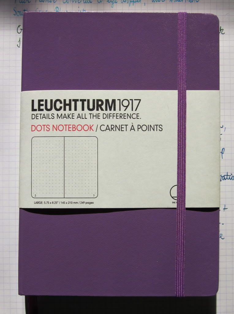
"Lilac" Leuchtturm1917

I'd intended to write up a sort of review of my first Leuchtturm1917 notebook, but...well, it didn't happen. At this point, I'm on my second of these notebooks, having finished up the original black blank one I bought at Powell's City of Books. The second, my current journal, is a purple dot grid version. So...due to procrastination, I have experience.

Apologies in advance for my usual crummy, yellowish indoor lighting photos. I do try.

I went through a period a few years back when I used Moleskines quite a bit as journals. This was when they were first gaining popularity. I liked the sleek feel of them, their simple, elegant appearance, the nice little features like the back pocket, bookmark ribbon, and elastic closure. Ultimately, however, I couldn't justify the cost, particularly since I had lots of issues with the paper and fountain pen ink: feathering and bleeding on some pages, beading of ink and smearing on others. Frustrating.

Photobucket
Moleskine feathering--see all the little hairy looking extensions on my letters? Eek! Oh, and the content of this entry may be familiar to some of the typospherians...

Photobucket
Bleed-through on the back of the page. Note that this was not a particularly "bleedy" ink, or a broad nib.

Since those early days, about a zillion Moleskine clones have showed up on the market: compact notebooks with the hard cover, the pocket, the elastic, the bookmark. The Leuchtturm1917 is one that is recently gaining some attention on fountain pen boards and such, and when I saw them at Powell's for a fairly reasonable price, I grabbed one to try.

Photobucket
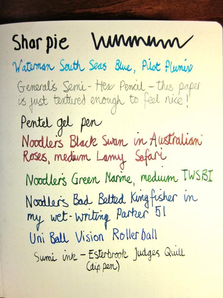
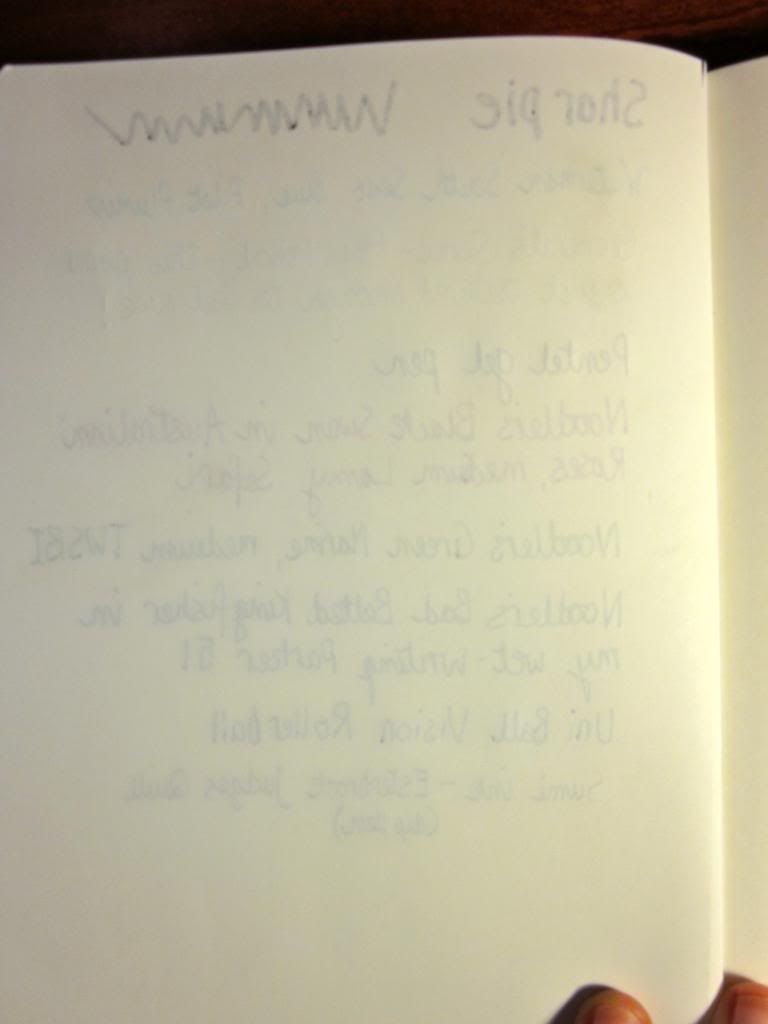
Page o' samples. I smeared the Black Swan...oops.

What I like:
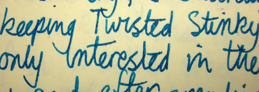
  • I've had almost *no* issues with bleed-through or feathering with fountain pen or dip pen inks. A very, very wet ink could possibly feather or bleed, but even my fairly wet medium fountain pen nibs do pretty well, as did dip pens with sumi ink. Also, the paper has just a hint of texture to it, making it nice for pencil as well.
Photobucket
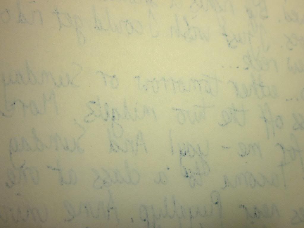
Back side of the page. There's show-through due to the thin paper, but really only the Sharpie bleeds, and only an eensy bit. Not bad...


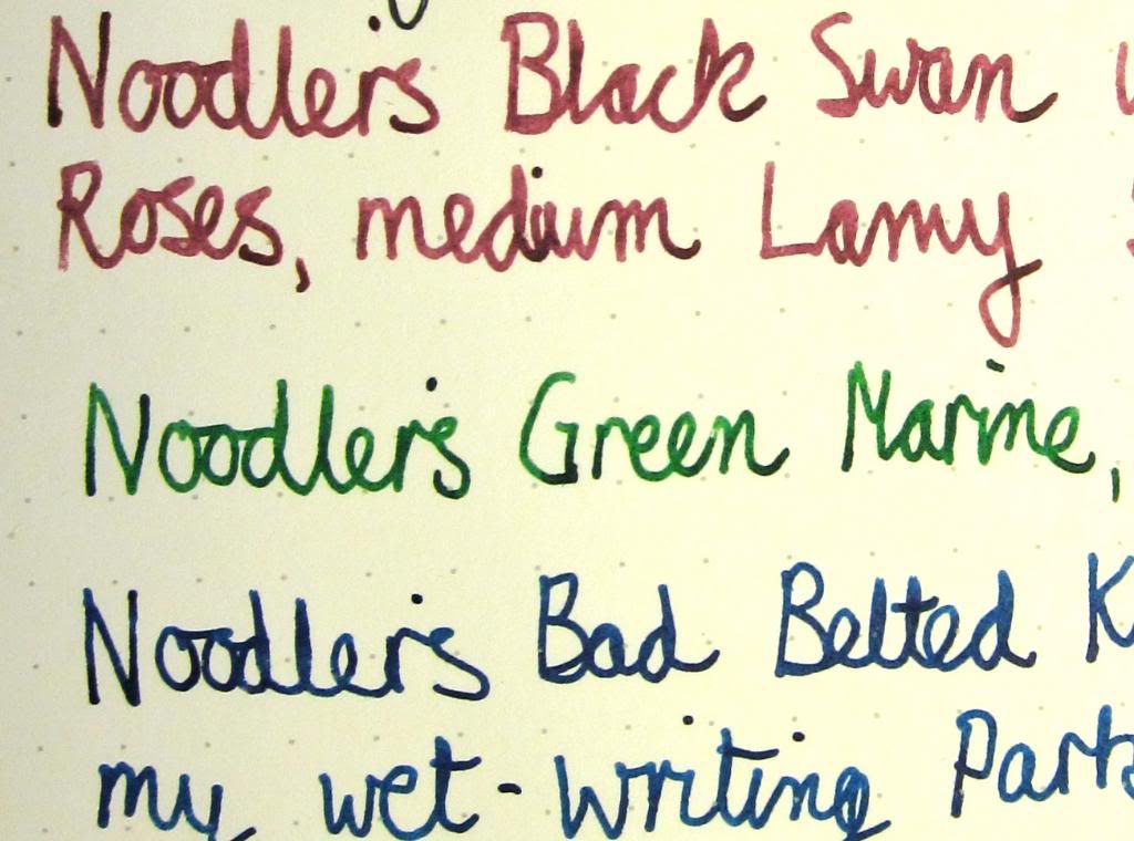
Close-up
And an attempt at a close-up, to show that there really isn't much if any feathering, even with pretty wet inks. Nothing like Moleskines, in any case.
  • Although I could buy a dozen Wal-mart composition books for the same price as one of these (and the Norcom comp books are still my choice for scribbling), as premium notebooks go, the Leuchtturm1917s are fairly inexpensive. I purchased this additional notebook from Writer's Bloc for $13 for a large notebook. Compare that with more like $18 for a Moleskine of the same basic size.
  • Pretty colors: many of the Leuchtturm1917 sizes and styles are available in a number of colors, for them what likes such things.
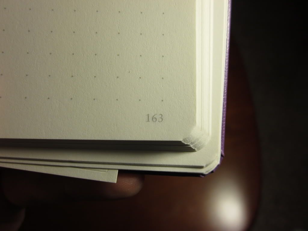
  • They have page numbers! Major bonus for me. I like to be able to gauge how much of a notebook I've used/how many pages I have left/how many pages I've written in a given day, and typically the first thing I do with a new journal is to sit down and mark page numbers. It's a tedious task, and I am very, very happy to have this done for me. The page numbers are very small and subtle and don't take up oodles of my writing space. Nicely done.
Page number
  • Dot grid format! I'm a new convert to this style of notebooks. They give you the freedom of a blank page, but with just enough of a visual guide to help you write neat lines. Also, the dots are subdued enough not to get in the way of lighter inks and pencil writing.
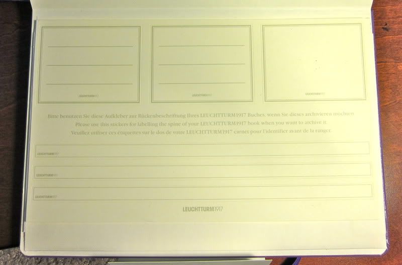
  • It's a small thing, but a nice detail nonetheless: these notebooks come with a variety of labels for archival purposes. I always date my journals after use, so I appreciate this. Another little detail that's a nice touch: the blank version came with a backing sheet that can be used behind the current page, with grid on one side and lines on the other.
Stickers
Lots o' Labelage

  What I don't like:
  • Although the pages lay *mostly* flat, there's definitely more of a "hump" than you get with Moleskine notebooks. It's perhaps my favorite feature of Moleskines, and I'm a little disappointed these are as bumpy as they are.
Photobucket
Even held flat...you still have to write into a bump. Don't mind my inky fingers...
  • Although I didn't encounter bleed-through or feathering, the pages are very thin (I kind of think they'd be better off making these with fewer pages and thicker paper) and there is a certain amount of show-through.
  • The covers are thinner and less substantial feeling than Moleskine. Overall, it just doesn't feel as sleek and ruggedly made as a Moleskine, though that may just be perception. I carried my first one around in a backpack crammed full of other books and odds and ends for two months with no ill effects whatsoever.
  • The elastic isn't as...well, elastic.
  • When new and newly unwrapped from their protective wrap, these notebooks smell funny. It's sort of a press-board sort of smell. It quickly wears off, fortunately. It's been awhile since I unwrapped a new Moleskine, and I'm sure they have a "new notebook" smell as well, but I don't remember it being objectionable in any way.
  • I've experienced some skipping issues: the paper, while very ink friendly for the most part, is pretty sensitive to skin oils. Fountain pen ink may skip on spots where you rested your hand. I sometimes have similar issues with other quality paper, though (i.e. paper that doesn't absorb ink like crazy). It's a trade-off.
Indifferent details:
  • The last eight pages are perforated and can be easily removed. Personally, it's not a feature I imagine I'll use.
  • In addition to the numbered pages, there's a blank table of contents page at the front to assist with organizing. At the moment, I'm not sure how I'd use this in a journal. For significant dates, maybe? Dunno. But it's there for those of you who would use such a thing.
Bottom line:
They aren't perfect, and I wouldn't declare them a Moleskine killer. For the zillion and a half people who use gel pens or ballpoints and who don't care about the other little features the Leuchtturm1917 offers, Moleskine may remain the better choice. And Moleskines are everywhere, after all. (Even Target, now!) They're convenient.

I'm sold, nonetheless. The Leuchtturm1917 notebooks have most of the features I like about the Moleskine (hard cover, bookmark, elastic, pocket, at least kinda lays flat) and a few others I really appreciate (page numbers, dot grid format), the paper is way better, and none of the drawbacks are utter deal breakers to me. They're my journal of choice for the time being. I just hope the price remains reasonable-ish!

Vitals as reviewed:
249 slightly off-white dot grid pages
Acid-free 80gsm paper
A5 size (5.75 x 8.25")
Designed in Germany, printed and bound in Taiwan

Friday, April 01, 2011

Naturally Gorgeous: USA Gold Natural

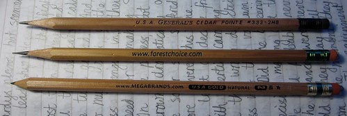
Pencils in the buff
Pencils in the buff: General's Cedar Pointe, Forest Choice, USA Gold Natural

Not quite a full review, and I know the photos are pretty lousy, but I couldn't resist at least a mention...

Last week, pursuing rumors of Rhodia notebooks on clearance at bargain basement prices, I stopped by my local Target. Alas, the only Rhodia notebook they had wasn't marked down all that much, and also looked like someone had dropped it on the floor and danced on it quite thoroughly in muddy shoes. So I passed. Since then, I've been able to fill my Rhodia longing at Powell's City of Books in Portland, OR, but at that moment, standing in the aisles at Target, what was I to do? I couldn't just walk away from the office supplies section empty handed, now could I? (Don't answer that...)

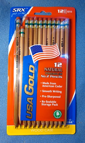
Fortunately I found an inexpensive consolation prize. Although I really, really, really don't need any more, I picked up a pack of pencils, namely some USA Gold Naturals.

USA Gold Naturals in Package
Yeah, I got impatient and ripped into them before taking any pictures...

The USA Gold Natural is made in the USA, as they make a bit obvious on their packaging. It is natural incense cedar, and smells like it--mmmm.  Very nice to sharpen.  It's also nice to sharpen in that the lead has been nicely centered in every one I've used so far.  This is important: poorly centered leads have become perhaps my biggest pet peeve when it comes to wood-case pencils.  Like the Forest Choice, the Natural seems to have a light coating of varnish or other sealant to protect it from dirt and graphite grime and moisture...which does mean it won't get that fascinating worn-in patina that the General's Cedar Pointes do, for better or worse.

Like its yellow-clothed brethren (the standard USA Gold), the Natural is a little on the slender side. (I believe the Ticonderogas have also lost a bit in diameter over the years in order to conserve wood.) It isn't terribly noticeable, though, especially after a moment or two of use.

USA Golds have dandy erasers, small but much better than is typical in this class--they don't flake, don't rip the paper, remove graphite cleanly, and the leavings roll into easily-brushed-away strands. And I like the colors of the ferrule: brass and green. Simple, yet distinctive.

USA Gold Natural Ferrule
Classy ferrule on these, in my opinion...

It writes well. Personally, I find it tricky to describe graphite pencils, particularly since I mostly use reg'lar HB grade without a lot of variation. You can only say "smooth and dark" so many times before it becomes meaningless. I'd say it's darker than a Ticonderoga, lighter than a Palomino or my Helix Oxfords, relatively hard-wearing without being gritty, and fairly smear-resistant, particularly compared to other inexpensive pencils. Howzat?  It's a good all 'rounder.


Ticonderoga/USA Gold Natural comparison. Difficult to show darkness and clarity in a scan...  I ran a finger over the word "smear," but pencil doesn't smear easily on Rhodia paper!

It's not a premium pencil, but it's light-years beyond the usual plastic-wood-mush pencil-shaped-objects that are typical in this price range. I like it.  Quite a bit.