Saturday, July 30, 2011

Type-In Report (warning: many typos ahead!)

July30Type-In_0001
July30Type-In


Oh, and this typewriter shall be called Gerard.  Edit (where are my manners!): I should mention that notagain was the generous soul who gave it to me.  Thank you again!

Oh, and one more edit: here's the fountain pen test scribble sheet.  I like Strikethru's little people!

Friday, July 29, 2011

Vignette #12 - Priorities (plus bonus mini-poem)

vignette12
And yes, I realize my priorities are as skewed as the other extreme...still working on that whole balance thing. For the record, I *did* do dishes and laundry today...

And a sort of a word doodle sort of thing I scribbled down at work today:
Intrigue

Thursday, July 28, 2011

Vignette #11 - Campfire

Smells: smoke of burning pine and burning maple, mingled spicy-sweet.  Hot dogs, some charred.   Melted chocolate, ketchup, mustard, sweet relish.  The sticky golden smell of toasted marshmallows.  The round green-wintergreen smell of the sharpened, bark-peeled-off birch branches we use for roasting marshmallows.

Sensations: gravel beneath my feet, the wind, smoke following a dance around the fire to sting my eyes and touch my hair.  The rough and sandy bark of the gathered tree branches we break to toss on the flames.  A fleck of ash touches my cheek: a burning brand.  I've a pebble in my sandals--shake it out, shake it out!

Sights: Flames, blue-tinged at the depths and orange and yellow and disappearing as they rise.  The sharp orange glow of coals, the blackened wood.  Sand and grass and big soft leaves that flutter in the breeze.  A blue sky that goes a deep purple-black as the day falls behind the darkened hills.

Sounds: crackle-pop, and the whispering roar of the flames.  Laughter, crickets, an owl, the snap of breaking branches.  The final hiss as we douse the flames, and amid sleepy murmurs of conversation, retreat for the night.

Wednesday, July 27, 2011

Score another point for the Classroom Friendly Pencil Sharpener...

Get it? A point? OK, so I should have used one I'd *just* sharpened, but...

I keep a handful of pencils at work, but since at the moment I just have the one Classroom Friendly Pencil Sharpener, I cart pencils home for sharpening and back again.  A few days ago, my boss (another pencil user) got her battery operated sharpener working after a hiatus, and went around the office sharpening pencils.  When she got to mine, she looked those lonnnng points over and said, "Wow, yours sure don't need sharpening.  How do you do that?"  I just smiled and told her I have an *awesome* sharpener at home.  I should demo it.

In a meeting the other day she complained about the quality of the pencil she was using to take notes.  I'm thinking I may have to bring in some Forest Choice and General's Semi-Hex and such.  May have another convert.

Tuesday, July 26, 2011

For Julian: A Tribute

Flame in a bottle
A brightly soaring spirit
The red betta swims

Going on four years ago, friends at work bought me a red betta fish for my birthday. He was a feisty little guy, all fins and attitude. I named him Seamus. For about three weeks, he lived on my desk, flaring at all passersby and rocketing through his little tank.

And then, he died. I was heart broken.

But I missed him, missed having something to watch during thinking moments at work. And strangely, I missed the sense of companionship--an odd thing to say about a fish, but just knowing he was there was nice.

A few months later, I bought another little red betta. I debated giving him the same name, but a co-worker joked that I should give him a gentler name to make him tougher: "Boy Named Sue" syndrome. After discussion, we decided on "Julian," both because it sounded a little less confrontational and because (I admit it, I are a geek) I had quite a crush on Julian Bashir in Star Trek:Deep Space 9 back in the day.

I got him all new food. I carted water from home every few weeks, in case there was something wrong with the water in my work building. I bought some fancy aquarium water treatment stuff instead of the inexpensive drops. And he thrived. For three and a half years, he was my work buddy. He hovered when I looked at him, as if listening. He danced around at feeding times until he caught my attention. He flared at everyone who stopped by my desk, whipping his tail and darting forward and back, looking for all the world like an angry little yappy dog. He spent hours carefully constructing bubble nests. He swam, with that gorgeous tail casting sparks behind him.

This weekend, he passed away. He'd been slowing down these past few months, spending most of his time resting on the bottom of the tank, so I knew it was coming. And as betta lifespans go, his wasn't bad, I don't think. He would have been fairly mature when I bought him, so he must have been over four years old, at a guess. It's not a tragedy, his death. He had a good betta life. But I already miss him. One of these days, I'll find another.

Maybe I'll name him Sue.

Thursday, July 21, 2011

Whole buncha inky thoughts and blots

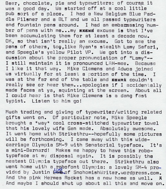
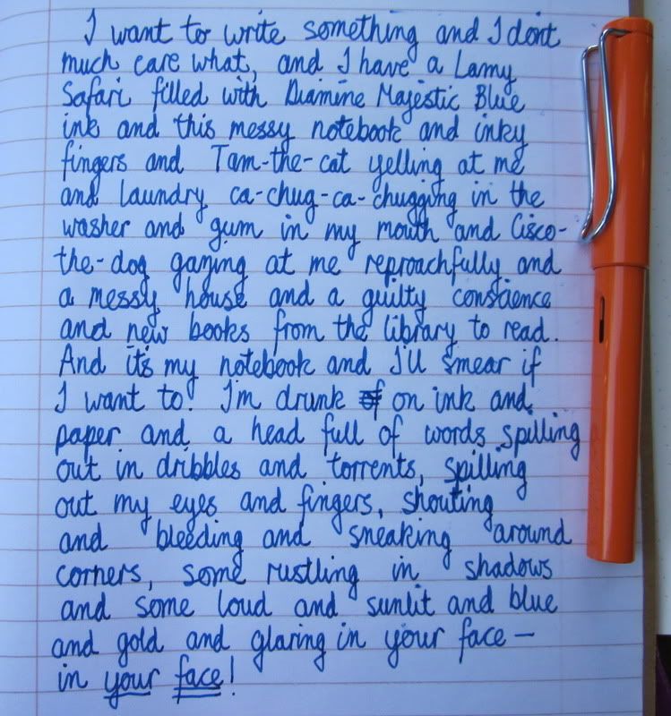
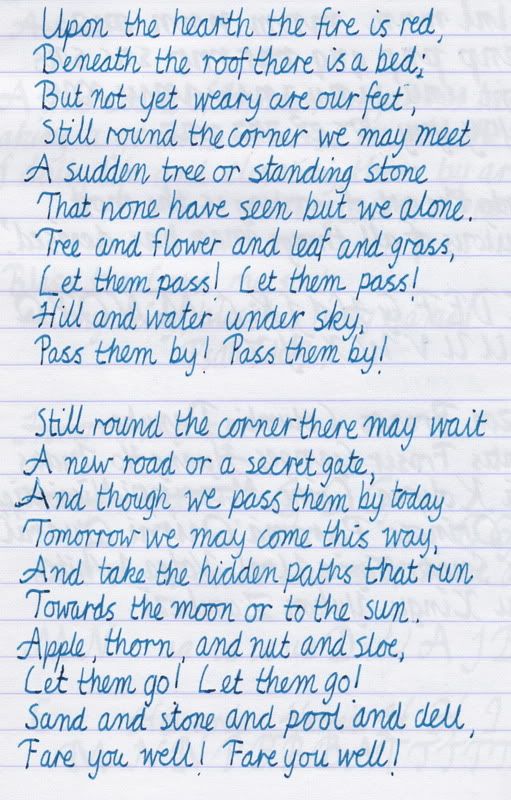
Thought I'd share few thoughts on some of the ink samples I've had a chance to try thus far. The photos are of swabs I made for my own use, on paper that's really too thin for such purposes and therefore went all curly, and I make no promises as to the accuracy of the colors...

Diamine Majestic Blue:
Ooh, I like this. It's a medium-to-dark blue with a certain depth to it, and on some paper (most notably the Staples bagasse paper I use for work and in my "sketch book"), it has a fascinating red-purple sheen at certain angles. I don't have anything else that's really close to this. Lovely, creamy, gorgeous stuff. Downside: it can be tempting to spend meetings endlessly flipping my notepad around trying to make that red pop out.

Lamy Blue/Black:
This ink is vaguely interesting, but not really much more than that. It has a little bit of iron gall content, so it goes down a pale slightly slatey blue and gradually (overnight or longer) changes to a greyer shade as the iron gall content oxidizes. It's an antiquey sort of color. Apparently Lamy is changing the composition of this bottled ink and will soon cease making it in its current iteration...so even that slightly interesting aspect will soon be gone. Not really on my buy list.

Private Reserve Electric DC Blue:
Very bright true blue. In theory, it has some reddish highlights a la Diamine Majestic, but they are far less pronounced. It's a truly lovely color, but like many other PR inks (in my personal experience), it is something of a drama queen. It takes a long time to dry. It smears when "dry." It is a pain in the neck to rinse out of a pen. I love Private Reserve inks for their vivid colors and their smoothness, I really, really do...but this ink just reminds me I should probably sell off or give away the bottles of PR I already have, because they annoy me enough that I don't use 'em. I bought a small lot of them from a poster on FPN a few years ago, and despite the lovely shades, they've barely been touched. I have little tolerance for emotional ink. Plus they don't have any water resistance or other such qualities to make you overlook their bad sides.
(And now that I've just bashed them up one side and down the other...if anyone has an interest in PR Midnight Blues, Black Magic Blue, Fiesta Red, Sherwood Green, Avacado [sic], or Lake Placid Blue, drop me a note back channel and maybe we can work something out.)

Noodler's Zhivago:
I've been curious about this ink for years now, but it varies enough in reviews I've seen that I felt like I really needed to see it in person before committing to a big bottle. It's an odd sort of color: either almost-but-not-quite-black, or a very dark green tending toward olive, depending on the pen and paper. In most pens, it's a grey-green-tinted off-black. It interests me, and it'd be really cool if I could trade PR inks for some...  I want some eventually, for sure.  I also love the name! Tragic and bleak and depressing though it is in so many ways, I really like Doctor Zhivago.

Diamine Syrah:
Nice. It's a lovely rose pink color with some shading, and it is silky smooth. However, it's somewhat similar to Noodler's Black Swan in Australian Roses, of which I own a whole bottle, and which has a "bulletproof" component that won't wash away in water or fade with time. I'd say Syrah is more ruby and BSiAR is more raspberry, but they're at least in the same family, and I don't really need both. But it's pretty! Recommended.

Diamine Oxblood:
This is another interesting color, and one that I could not for the life of me capture with camera or scanner. (You can tell how much I tweaked this one, trying to get it right.)  It really looks like its name, which is...fascinating but perhaps a bit icky. Ever bought meat at a butcher's counter? You know those stains all down the front of his apron, or the stains you see on the paper your hamburger comes wrapped in? That's what this looks like. Not only that, but as it comes out of the pen, it's a fairly bright red, and then it *dries* to that rusty brown-purple oxblood color. Ew? And yet, it's a very attractive shade.

So far, I'm most tempted by Zhivago; and by Diamine Majestic Blue just because it's like nothing else I own and because it performs beautifully. And the Oxblood is on the "maybe someday" list.  But overall, I'm not coming out of this wanting to buy full bottles of most of this stuff. For one, my archival paranoia keeps flaring up--I more or less trust the Noodler's Black because even the oldest journal entries made with my first bottle of the stuff remain unchanged, unlike every other ink I was using at the time (the difference between Quink Black and Noodler's Black is particularly striking). Many of the other Noodler's colors have a similar durability--some portion of the color may fade with time or wash away if they get wet, but they have a core that remains no matter what. I don't trust most other fountain pen inks for anything but day to day notes and drafts, and to an extent it annoys me to have pens filled with inks I can only use for certain purposes. I'd rather have inks I can count on through thick and thin.

Gratuitous shot of my favorite ink, just 'cause.  See all the subtleties going on in there?  Oh, I love this stuff...

It has been fun satisfying my curiosity about lots of "I think I like it, but..." sorts of colors. I'd saved up a number of them over the years. And it's fun just playing a bit with inks outside my norm, without any long-term strings attached. But when it comes right down to it, I'm liable to fall back into my Noodler's ways, and in my heart-of-hearts I prefer conservative colors for most writing: dark blues and blacks and browns...maybe green now and again. Having a few different colors/shades in circulation is nice--I like to alternate so I can see where one day or one writing session ended and another began. But I don't need a ton of inks to do that. And while brighter colors are fun, if I'm spending more time thinking about the color of my ink instead of getting down to business, there's something wrong. I'll make an exception for Black Swan in Australian Roses. It's just that pretty. And hey, you need a contrasting color or two for editing or off-days, no?

Black Swan and Syrah together--not the same by any means, but sort of cousins.  

Tuesday, July 19, 2011

Vignette #8 - Sharp

Since I've slipped into poetry, and while I'm in revealing-my-dark-side mode...I present another not altogether cheery piece...

vignette8

Vignette #7 - Talk at Twilight

A poem this time. Not sure I like this one...there's maybe too much left to the imagination of the reader for it to make sense.
vignette7

Monday, July 18, 2011

Vignette #6 - Spat (and now for something completely different...)

Total fiction this time around, and right at the edge of what I'm comfortable with writing.

vignette6
I may expand this into a short story some day. I'd like to know who these people are, and...maybe not so much redeem them as set them off on the road toward redemption.

Sunday, July 17, 2011

Made myself a story board!

Cork board

As I mentioned a few posts back, I decided to go back and try to untangle and complete a sci-fi sort of story I started years ago. That story is, in short, a mess of epic proportions. It has multiple plot lines and narrative voices, and--just to make it all the more fun--the original plot line upon which all other plot lines were constructed...wrote itself out of the story. It doesn't fit anymore. Most of the characters that were a major part of that plot line don't fit. Which means the whole rest of the mess needs to be extricated from the grip of the dead plot line and rewritten to stand alone.

Now, as I've mentioned a time or two, I'm pretty much a seat-of-the-pants sort of writer. Planning would not have kept me from this mess. I end up in these sorts of situations every darned time, planning or no. But now, I need to redo time lines to make bits and pieces match up, and trying to hold it all in my head wasn't working. It's the primary reason I shelved the story to begin with. I need to visualize where people are supposed to be and when and where so all the narratives line up.

I've tried coming at this a few different ways: writing up a synopsis (I got lost), drawing up tables (I got lost), attempting to draw a time line on paper (I got lost, ran out of room, and kept remembering additional scenes I needed to cram in). I decided I needed something I could easily see all at once, *and* restructure until I have it all straight. A cork board seemed like a logical choice: something I could see and touch and move around to my heart's content.

Photobucket

Cork squares are on sale a lot of places this time of year--they're a cheap alternative to full bulletin boards. Not as nice looking, no, nor as sturdy...but you can make a four foot bulletin board for under ten bucks! Not bad. If I lived somewhere with really awesome thrift stores that had used cork boards in great condition, I'd probably do that instead, but I don't. These should work fine for just paper, though, which is all I really want them for. And it was nice to be able to define my own shape.

The squares I bought came with little foam mounting squares. Not knowing if they'd come with such a thing or not, I bought some Scotch brand mounting squares. I didn't buy quite enough of the Scotch squares to use all around, because I grabbed a pack *before* I decided to get two packages of cork squares. In retrospect, and for future reference...I should have bought more Scotch squares. The mounting foam thingies that came with the cork squares were eeeeeeeevil. Horribly, horribly evil. In particular, they had an absolutely maddening tendency to adhere to their own backing paper, so when you tried to peel it off to reveal the stickum, a whole layer of foam would peel away, revealing a completely not-sticky and useless interior layer.

Photobucket

I said some bad words in my head a few times on the squares where I used those. The Scotch squares, in contrast, were easy peasy--peel, stick, peel, stick. No drama. And they strike me as much sturdier as well. Worth the price of admittance.

I still have to play with this setup and figure out how best to make it work for me, but I have a good feeling about it. I'm going to mark some dates or at least year markers on the paper strips, and for the moment I'm using different colored cards for different characters--not really essential, but I like how bright it looks. Hopefully I can finally get this thing figured out so I can get back to writing!

Thursday, July 14, 2011

Vignette #5 - The Big Old Tree

I sat down and read a bunch of definitions of what a vignette should be, and I think I'm more confused than ever. I'm not sure most of my previous blurbs qualify, and I'm equally unsure about this one, but it's what I wrote, so it's what you get...

vignette5

Awful lot of repeated phrases and words and other such things, but this being a typecast...what you see is what you get.

Tuesday, July 12, 2011

Vignette #4 - Daybreak

I'm behind on these things, I think...had a bad cold/flu thing over the weekend that pretty much put me down for the count. For the record, reading peculiar sci-fi whilst feverish can lead to some interesting sorta waking dream type things. I'm not sure if that's good or bad. This has nothing to do with the vignette, however.

vignette4_0001

In other news, somewhere between the peculiar sci-fi and the waking dreams and some other reading, I'm really fired up about finally finishing my first sci-fi novel...not this past year's NaNoWriMo project, but an older story. It needs to be taken apart at the seams and completely and ruthlessly rewritten, so I'd shelved it for ages. But now...I think I have enough distance from the initial writing that I can carve it up and start again. Yay for a summer writing project!

Tuesday, July 05, 2011

July Vignette #2

I'm terrible at titles. Everything that occurred to me was cheesy. It shall be nameless, poor thing.

Commute

Monday, July 04, 2011

Penmanship: an On-going Odyssey

Mom's Franciscan Liturgy of the Hours

My mother had beautiful handwriting.  Even her everyday hand was pretty nice, and when she took her time, she could write just like the examplars in the Zaner Bloser handwriting books we used as kids.  (By the way, does anyone else remember those funky shaped blue and red Zaner Bloser mechanical pencils?  Loved those!)  Sometimes, to give us extra practice, Mom would write additional sentences and exercises out on our practice paper, in penmanship so perfect that it could almost have been typeface.  And back when she was in college, if friends had to miss a class, they often asked her to take notes, because they knew her handwriting was wonderfully legible.  My father, on the other hand?  Let's just say no one in their right mind would ask him to take notes for them.

Guess whose writing I inherited?

I managed to write more or less decently in school, but as time went on, my penmanship sort of...went feral.  As in...became truly appalling.  I could have been in the running for worst handwriting of all time.  Don't believe me?  I have proof.  Here's a scrap of a story I wrote for my little sister back around '02 or '03.

Secret Princess

For years, I kept journals in this sort of chicken scratch.  I knew it was bad, but since I didn't do a whole lot of re-reading my journals, I just lived with it.

Then came my first NaNoWriMo, when I got back into fiction writing for almost the first time since high school.  I discovered that I liked writing by hand, and that I liked what I wrote by hand, and often found it easier to find the right words when writing by hand rather than on the computer.  Plus, I could write wherever and whenever.  Just one issue: interpreting my own handwriting later on was a painstaking, tedious chore, especially if I'd been trying to write fast.  Sometimes I had to paraphrase when transcribing, because I simply couldn't read my own writing.  Ludicrous.  That was also about the time I started getting into fountain pens in a big way, and it seemed shameful to write so horribly with nice pens.  I decided I had to mend my ways.

At first, I worked on writing more like I had in school: the Zaner Bloser style cursive I'd learned in grade school.  But then I came across mention of cursive italic writing, and--more specifically--a book called Write Now that provided instruction in this style of cursive.  It's less ornamental than some styles--pretty no-nonsense, really--and faster than printing.  Since my main goals were legibility and speed rather than anything fancy, it sounded like just the ticket to me.  I ordered the book, and began the process of completely revamping my penmanship.  I practiced whenever I could.  It was during a period when I was also moving across country, taking on many other new challenges.  I remember hotel rooms in Pennsylvania and Iowa, where I spread out Write Now and Clairefontaine paper (another new discovery) on unfamiliar tables to practice writing individual letters over and over again or copy out poetry.

Practice

It didn't exactly come easily.  I'm the sort of person who couldn't draw a perfect circle to save my life, and since I was fighting against years and years of muscle memory and bad habits, it was often frustrating.  And I admit, in the end, my day-to-day writing isn't even as good as the writing I did on those practice sheets.  I will never be one of those people with effortlessly beautiful penmanship.  But I did come out of it all with (in my opinion) a much more legible hand.  Here's a page from a current notebook, casually written at a good clip.

Journal entry

It isn't perfectly neat by any means, but I can read it!  Lately, though, I'm noticing some backsliding.  In particular I struggle (as I always have) with keeping the slope of my letters even.  Also I can get sloppy with the connectors between letters, which can make some words confusing.  With the new ink here to play with...I'm thinking it's time to return to handwriting boot camp for a bit.  My penmanship is still very much a work in progress.

Sunday, July 03, 2011

Tiny Tenino Type-In


Siblings

Tenino Type-in


Tenino Type-in_0001

Oh, and one more piece of exciting news!! There is a very good chance that the Tribe of Clickity-Clack will soon include an Olympia with a Senatorial type-face again!

And for my own reference if nothing else, here is Notagain of Manual Entry's earlier blog post about ink making and local oaks.

EDIT: notagain now has a type-in write up on Manual Entry.
EDIT AGAIN: just noticed that I repeatedly referred to the Lettera 31 as a 33 in my typecasts.  I know better, really I do.